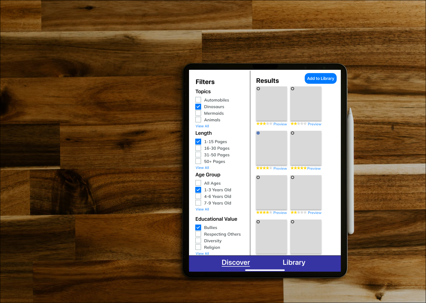
Privato Fitness
Intro
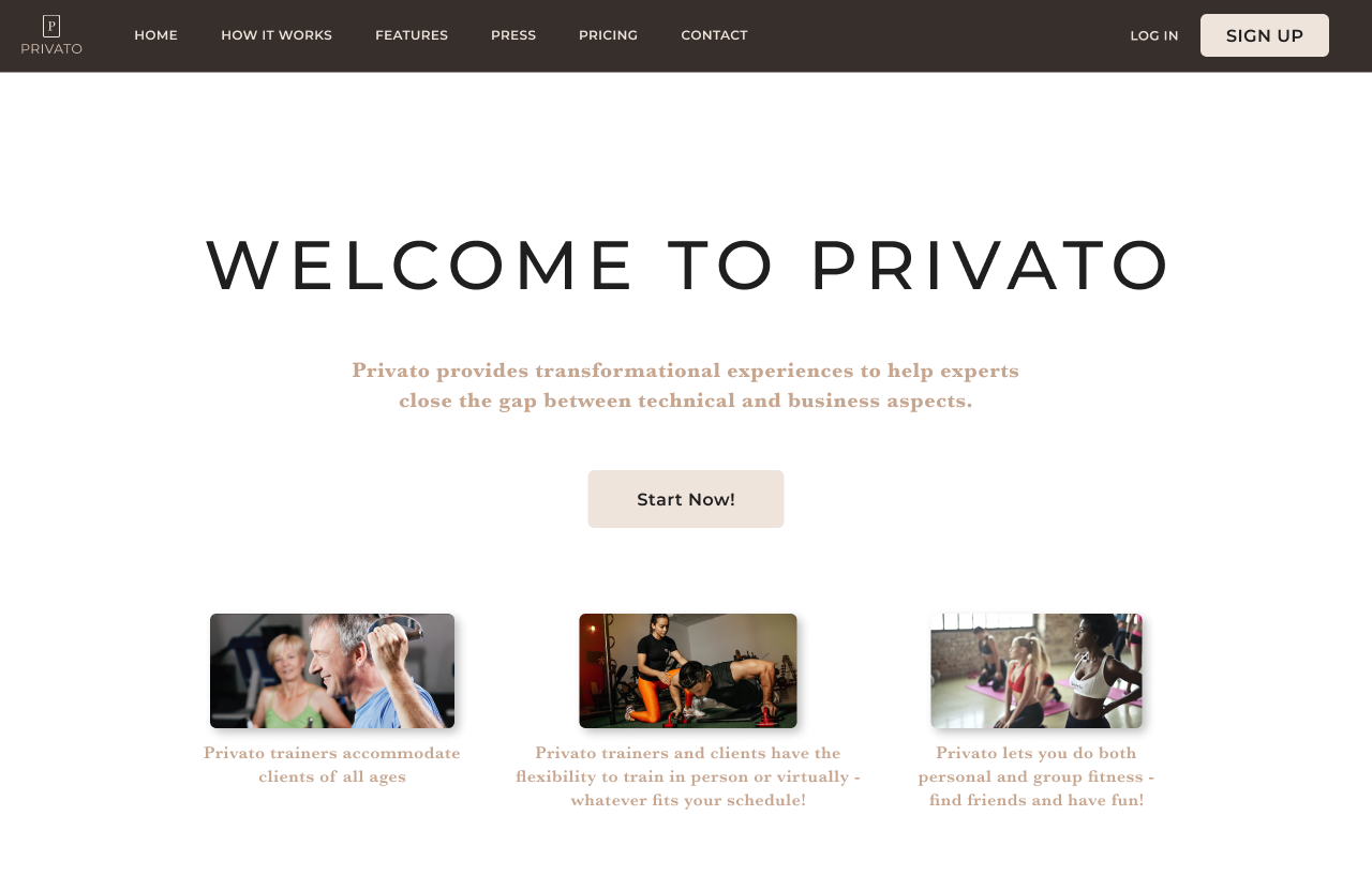
Many fitness entrepreneurs face a critical problem when trying to strike it out on their own: they know how to operate the fitness side of things, but aren't good enough with entrepreneurship to become profitable. The Privato platform, part of the wider EmpirePreneur brand, looks to close the gap for trainers moving from purely training to fitness entrepreneurship.
Privato Fitness solves the problem of trainers connecting with with compatible clients and operating their fitness brand.
My Role
As a UX Designer, my role on the Privato Fitness Project was to implement the entire User Centered Design proecess end to end with a team of 3 other UX designers.
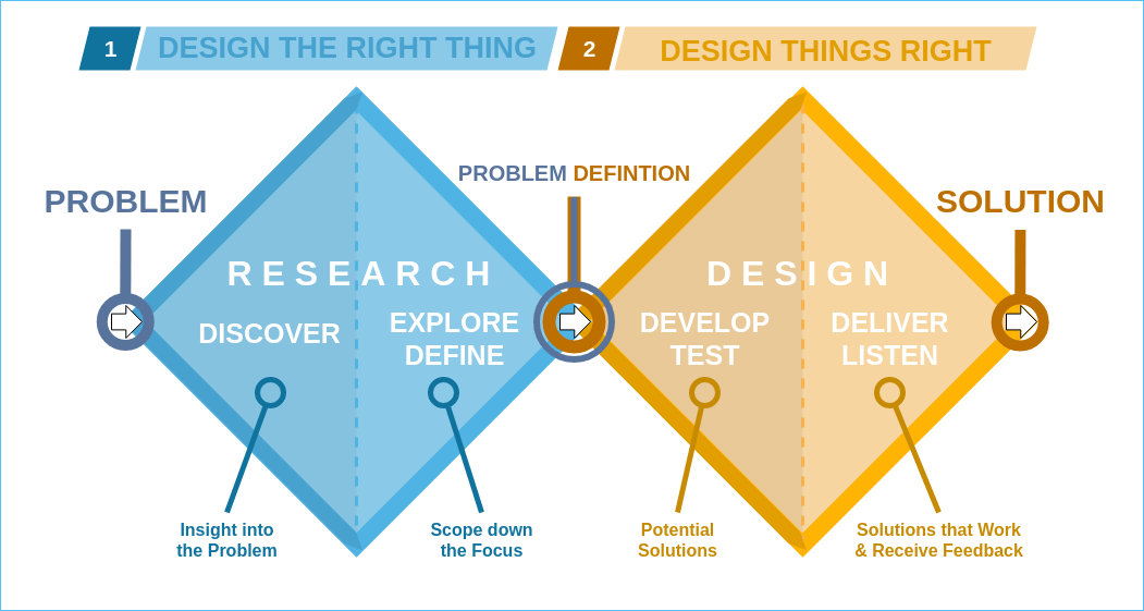
Our process followed the below methodology:
- Discover
- Problem identification, competitor analysis, userresearch
- Define
- Research synthesis, user personas, How Might We questions, user stories, user flows
- Develop
- Sketches, low fidelity wireframes, style guide, high fidelity wireframes
- Deliver
- Usability testing, design iterations
Discover
I talked with the client about business needs
Because this was my clients' first phase of working with designers, I wanted to align on what his business goals were
His ultimate goal was to:
- Help fitness experts grow and scale their business faster
- Close the gap between technical expert and business expert
After understanding his business needs and vision, I learned that our final deliverable would be the beginnings of a technical solution for fitness experts and clients.
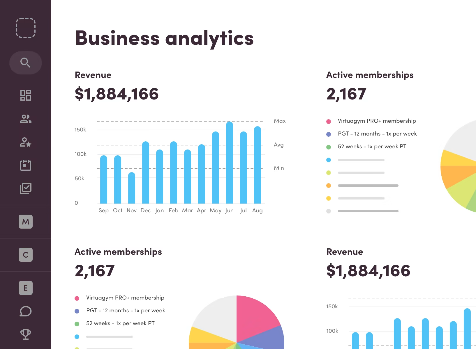
I conducted a competitive analysis
To better understand the fitness space, my client asked me to review four fitness platforms that he wanted to use as inspiration for the Privato Platform
Trainerfu
Trainerize
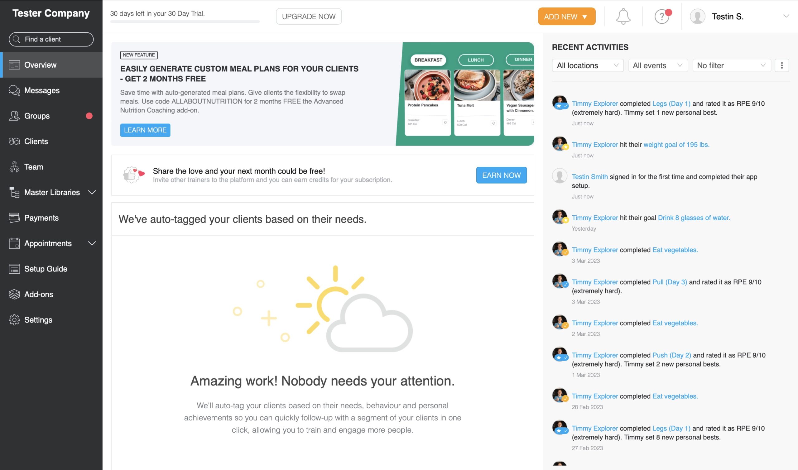
Virtuagym
PTDistinction
Here were my insights:
- Privato needed to have a good interactive and visual design
- A dashboard with tracking KPIs delivered a lot of value
- Some kind of start up guide/onboarding flow would help new users
- Intuitive workout plan editing/creation was critical
I conducted initial research with some users
I originally hoped to conduct user interviews, but do to time constraints I was only able to conduct my initial user research via a Qualtrics survey with 8 participants.
Define
I analyzed results with an affinity map
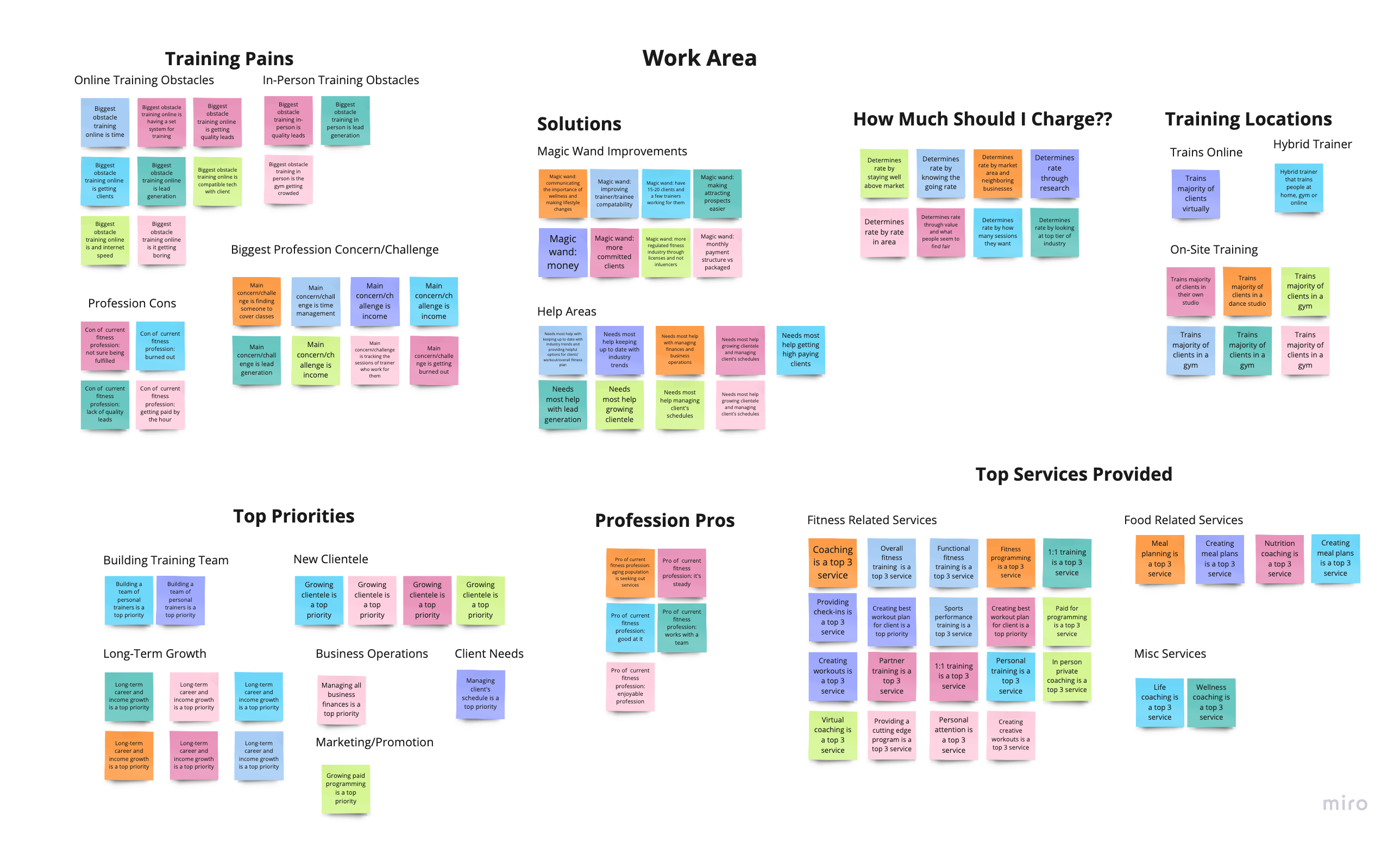
I used an affinity map to better find the overarching themes from my data in order to better understand where my users' needs were centered. I gained the following insights:
- Filling their time with client sessions was a top priority for over 75% of participants
- Training rate is variable and should be customizable to the user
- Trainers are looking for mutually beneficial relationships: committed/quality clients, and an easy way to recruit/find them.
- Online training platforms should be easy to use for both trainer and client
- Privato needs to excel in all things personal training: workout programming, and doing regular check-ins, etc because this was a top area of most users
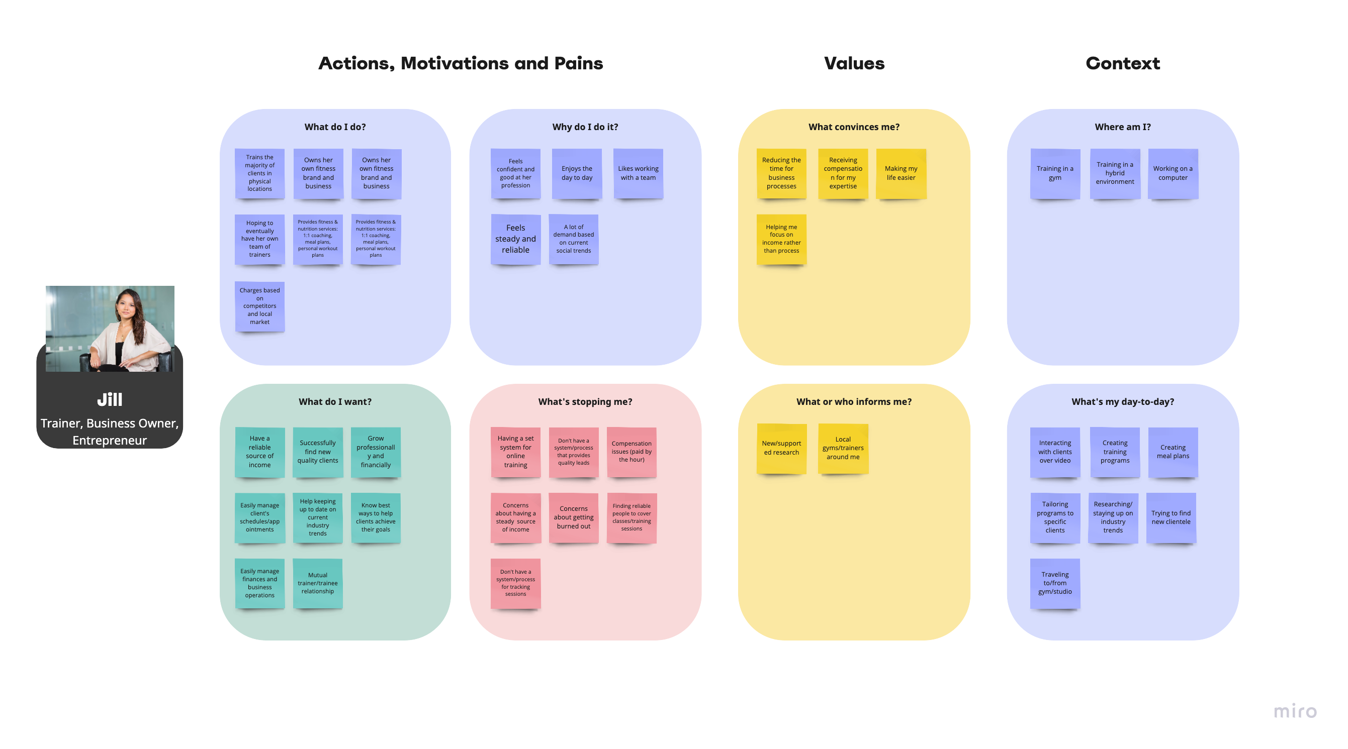
I created a persona to better focus our design efforts
Since this design effort could span multiple teams, I wanted to make sure my designs were focused on people, so I created a persona to reflect my findings from my research and also to help guide my design efforts for this project.
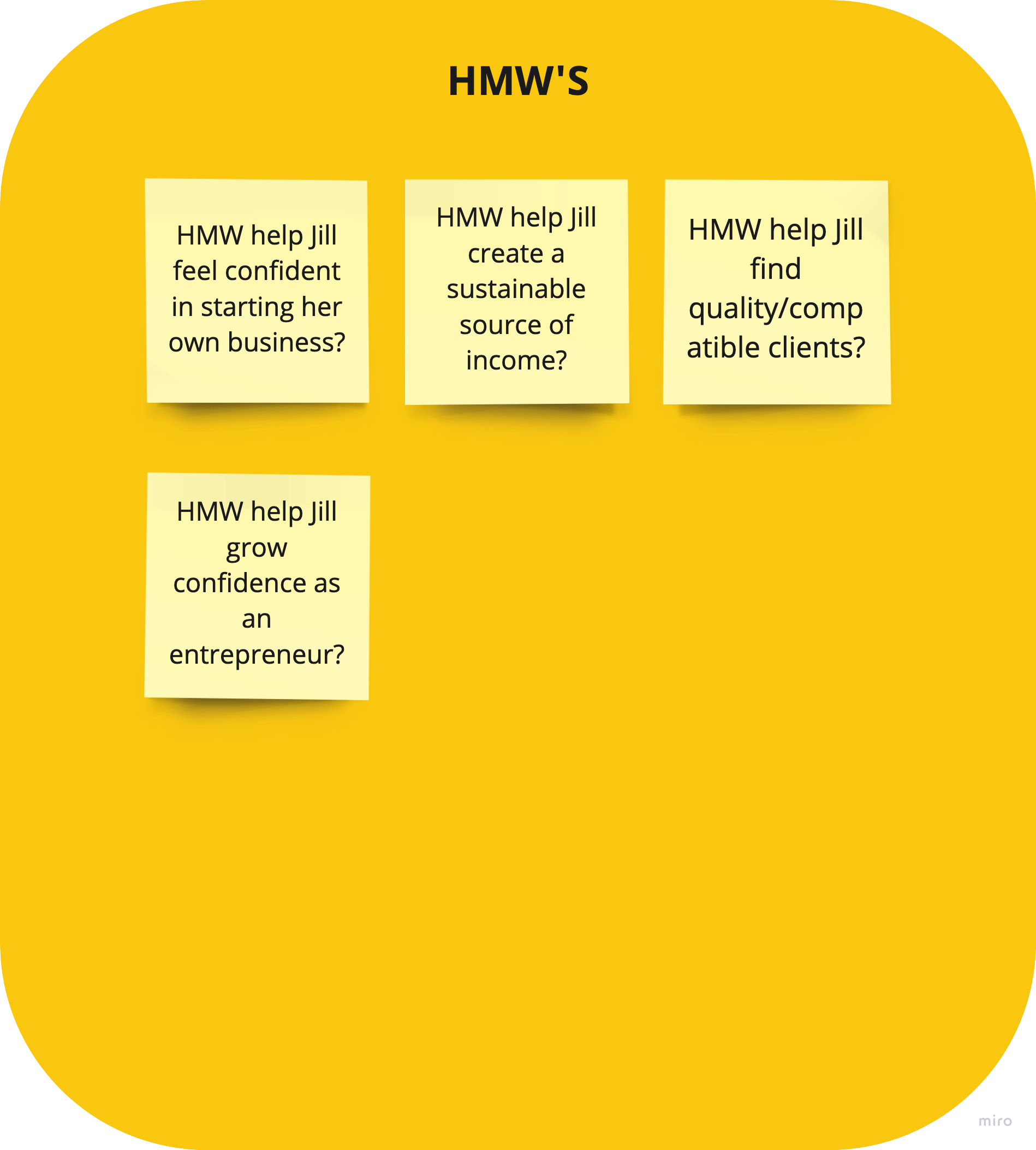
I created HMW Questions
Because I'd yet to truly define my research as problems to solve, I created HMW questions to focus my design efforts on problems to solve.
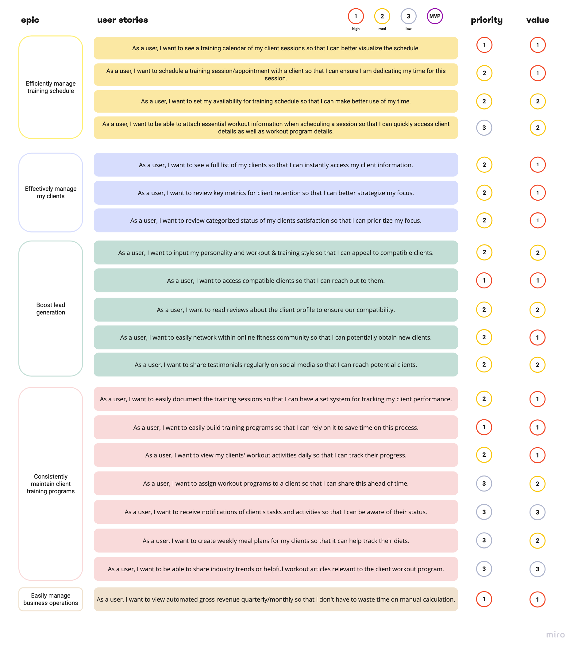
I created user stories
After creating HMW questions to focus on problems to solve, I needed to further break these down into actionable pieces for this specific sprint I was conducting with my client. To do this I made user stories around my original HMW questions.
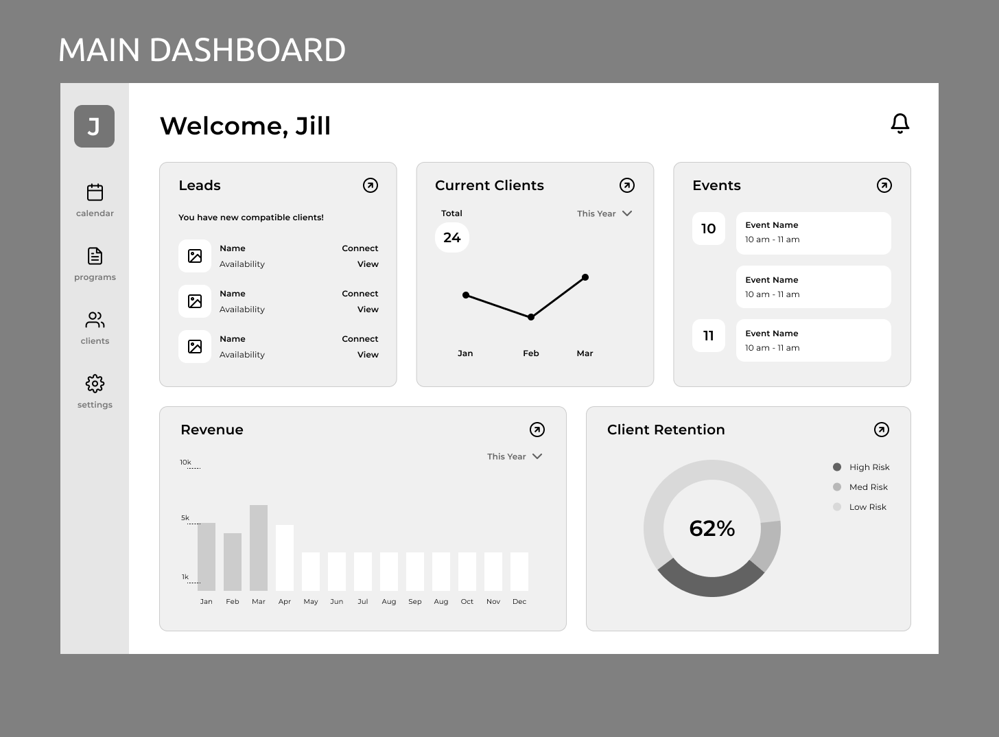
I identified that the following functionalities/features were critical and therefore would be a possible design focus during the project:
- Viewing training calendar
- Scheduling a client session
- Reach out to clients they're interested in training
- Easily build reliable workout programs
- View revenue (and other important business KPIs) in a simple way
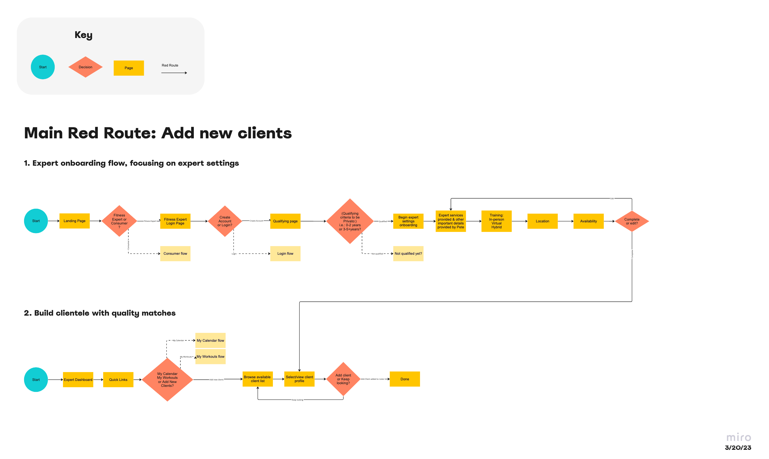
I created user flows for my red routes
After creating all of my user stories, I started creating user flows for some of the critical paths the target user would be pursuing when trying to accomplish their goals.
After reviewing these paths with my client, I realized that creating designs for these red routes would be much too much for the scope of this project. For this reason I revised the red routes from 4 (image on the left) to 2 (image on the right):
- A red route for clients to add new clients
- A red route for creating a an account and getting set up on the Privato platform
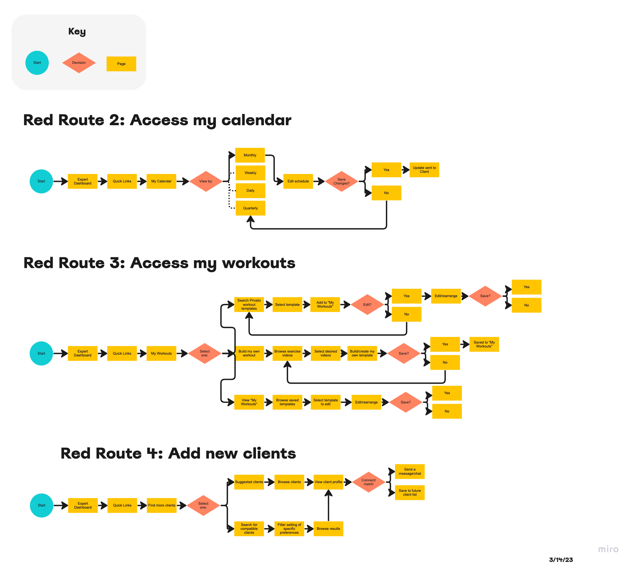
→
Design
I sketched out solutions for our 2 red routes
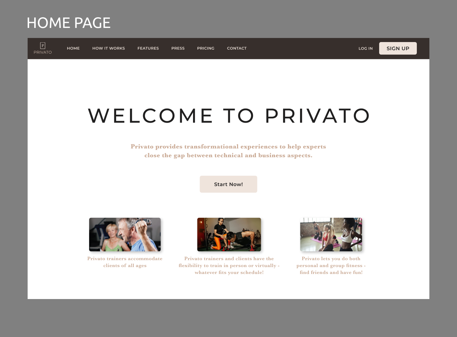
The client originally outlined that this solution should be a desktop application with the possibility of being on mobile further down the road. For that reason I focused on sketching solutions for a desktop solution, focused on onboarding and accepting new clients as outlined in previusly in my red routes.
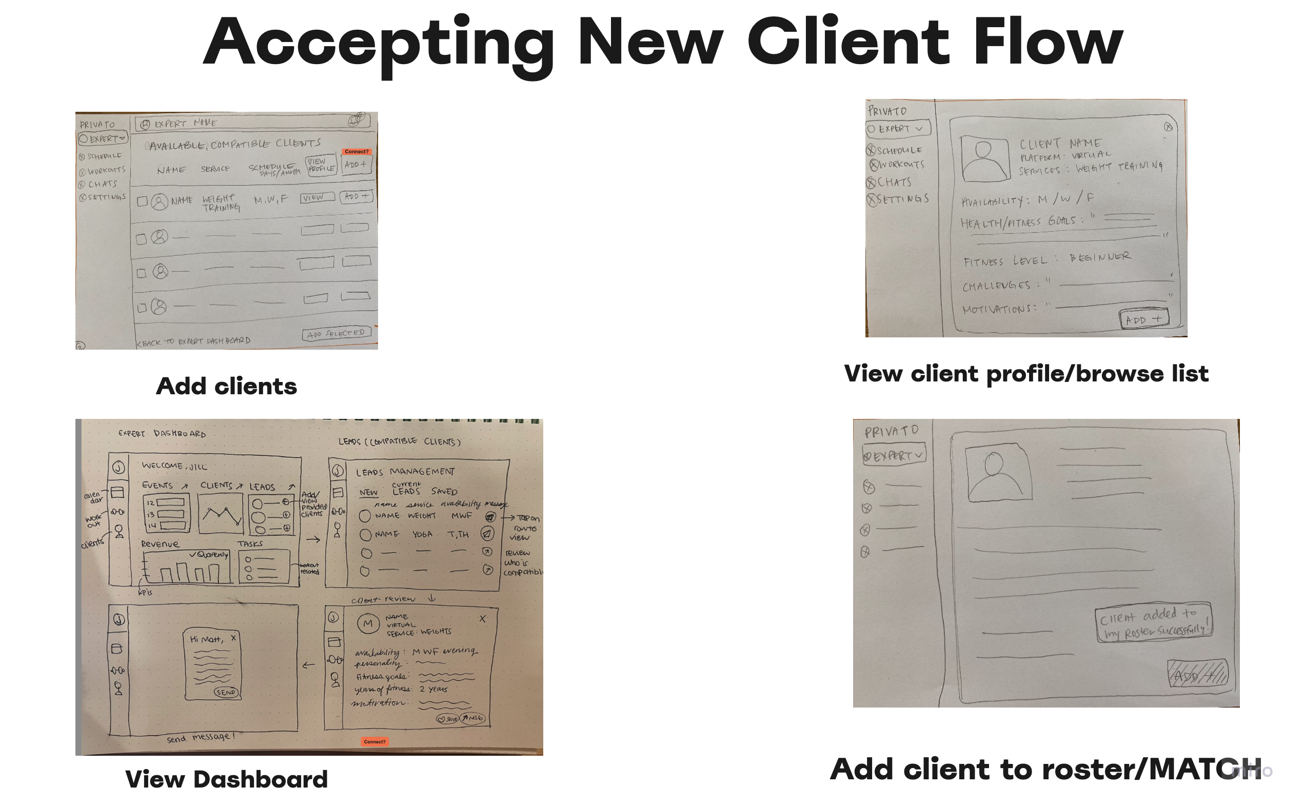
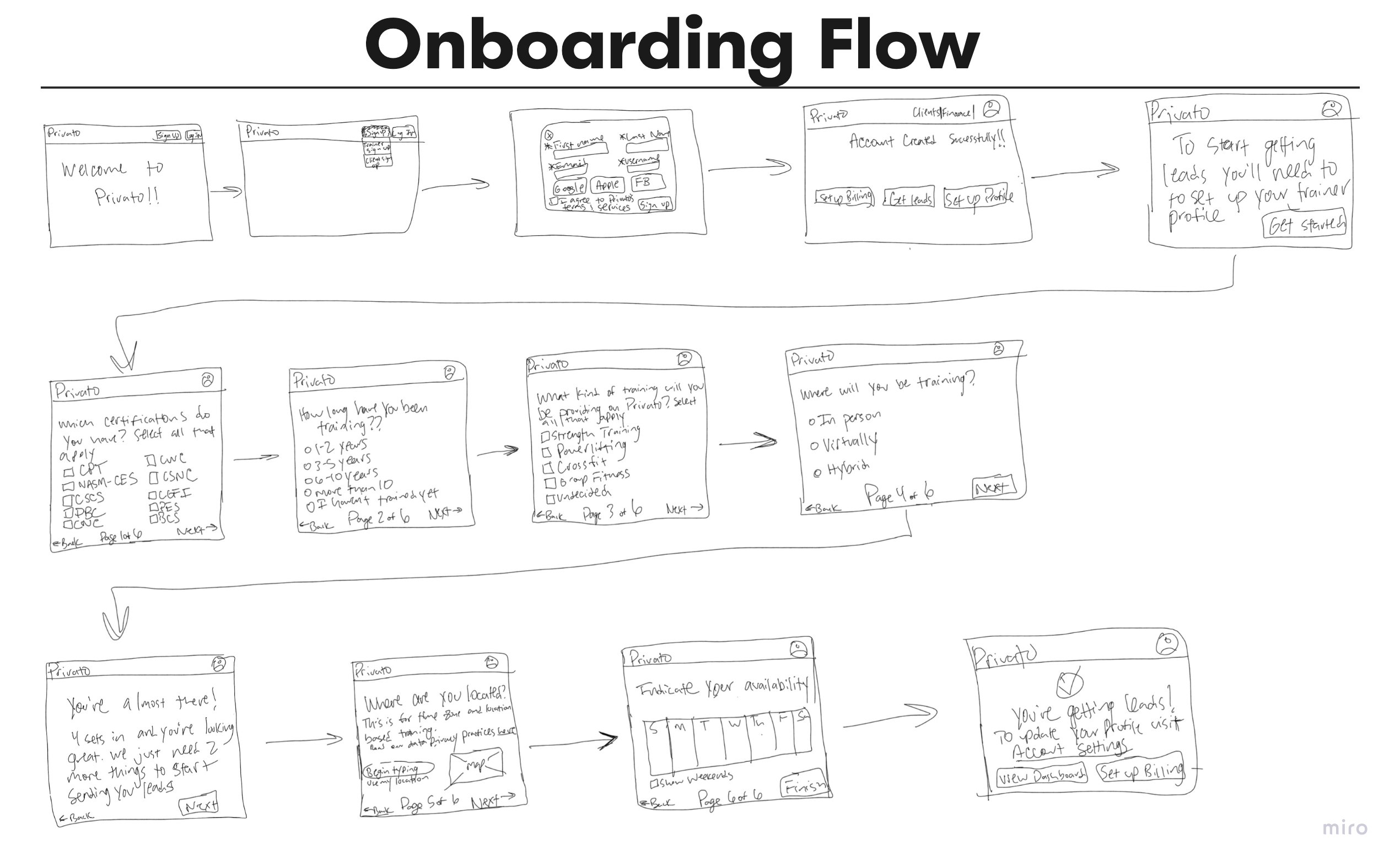
Due to time constraints and client availability, I moved onto creating low fidelity options for our designs without validating anything with potential users.
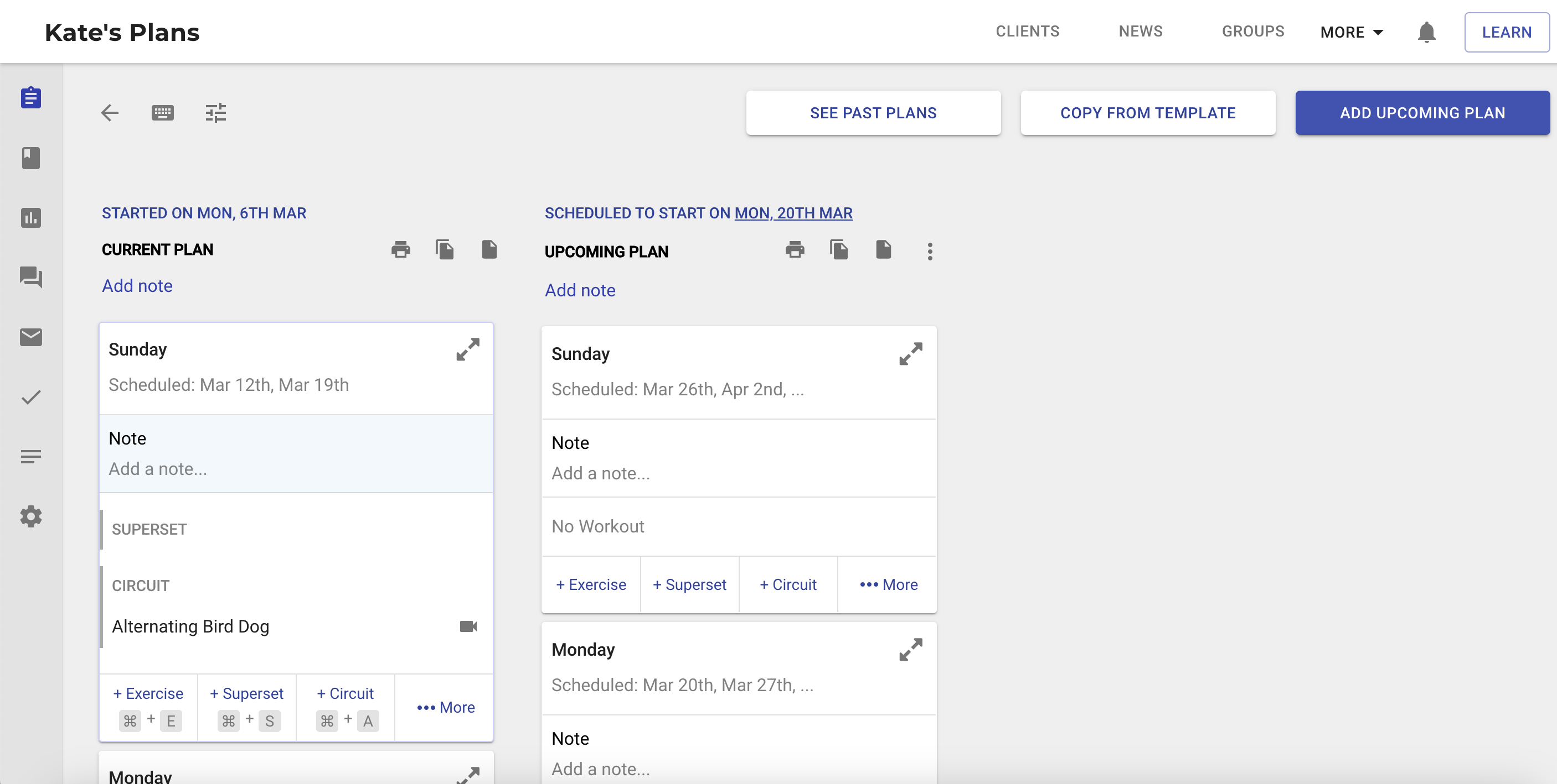
I created low fidelity wireframes
Using Figma, I created some low fidelity designs based on my sketches. After showing these to the client, I didn't get any pushback or concerns before moving to more high fidelity designs, so I moved forward in making these wireframes more high fidelity.
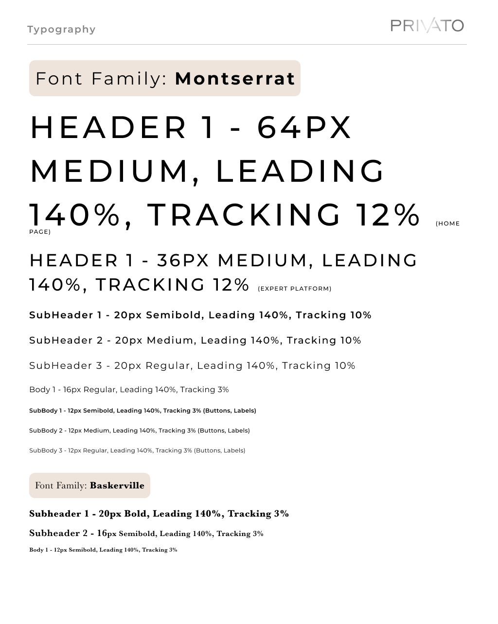
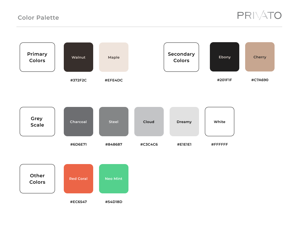
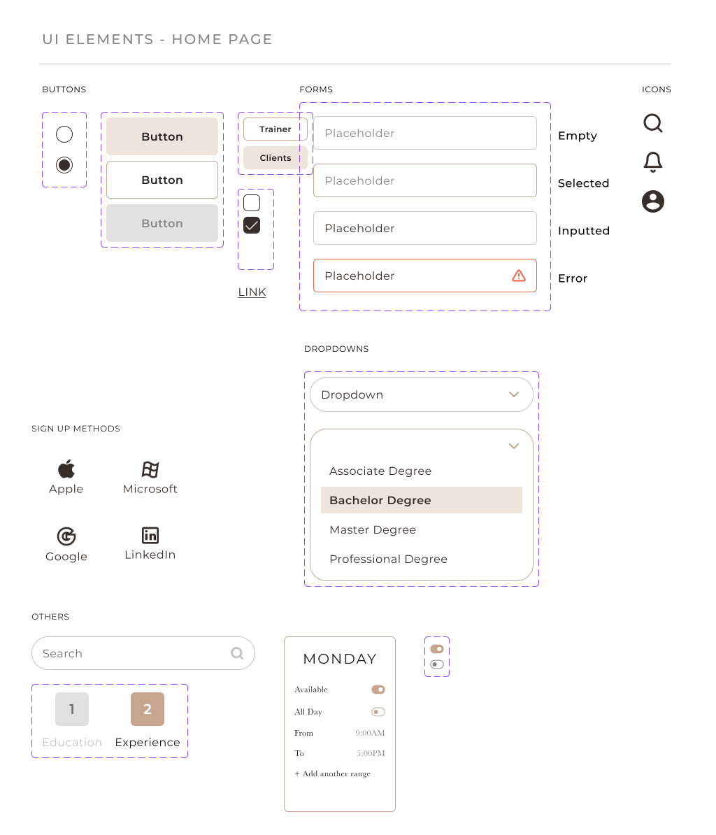
I created an initial style guide and high fidelity wireframes
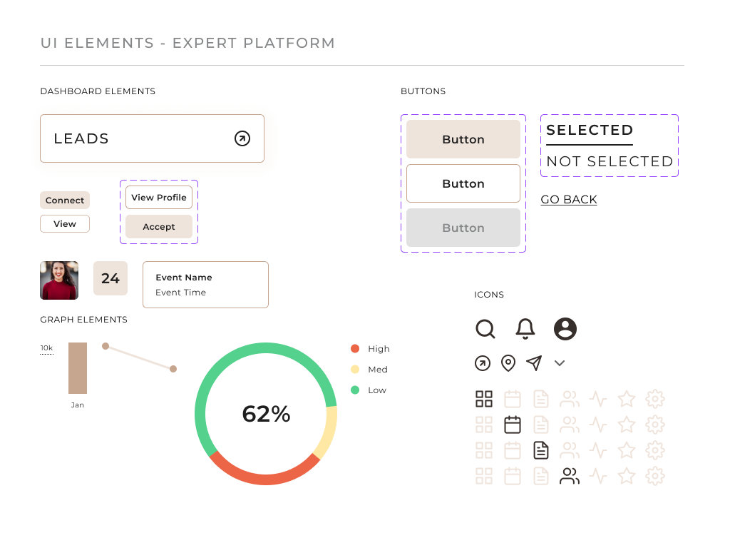
My client already had initial branding and typography to start from on our style guide, so I began creating system-specific buttons, icons, and interactions to use during the entire development of the Privato platform. I used my clients' ask to evoke trust and industry-leading brand recognition when designing the symbols and buttons, which resulted in using lighter tones and more rounded shapes.
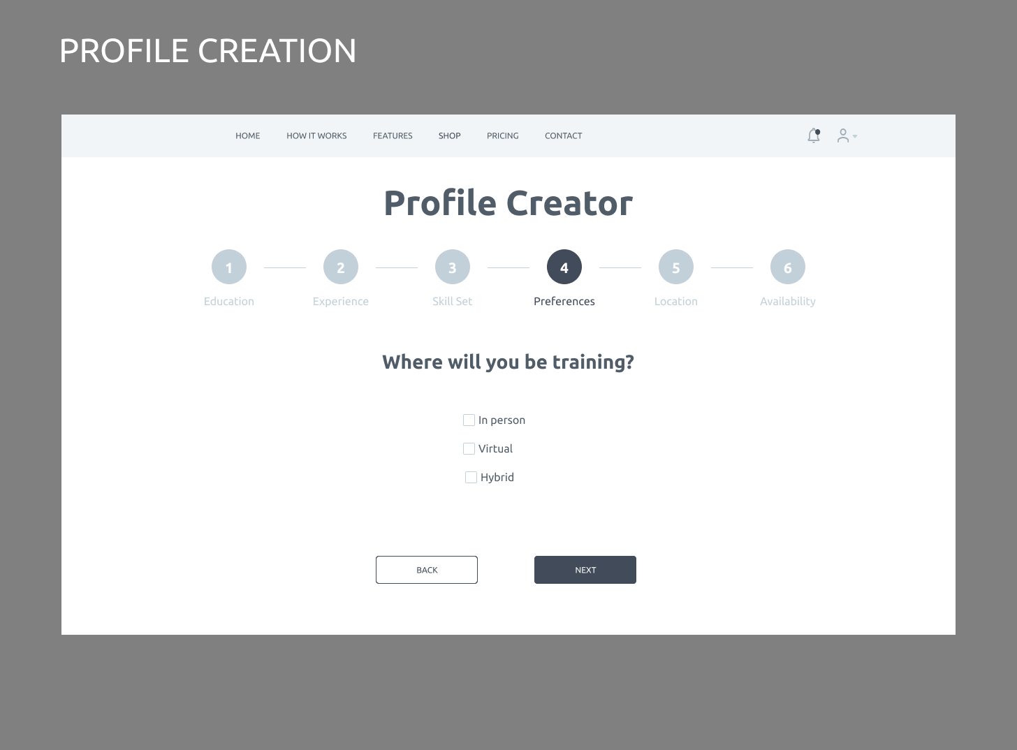
I moved to creating high fidelity designs with the following assumptions and input from the client:
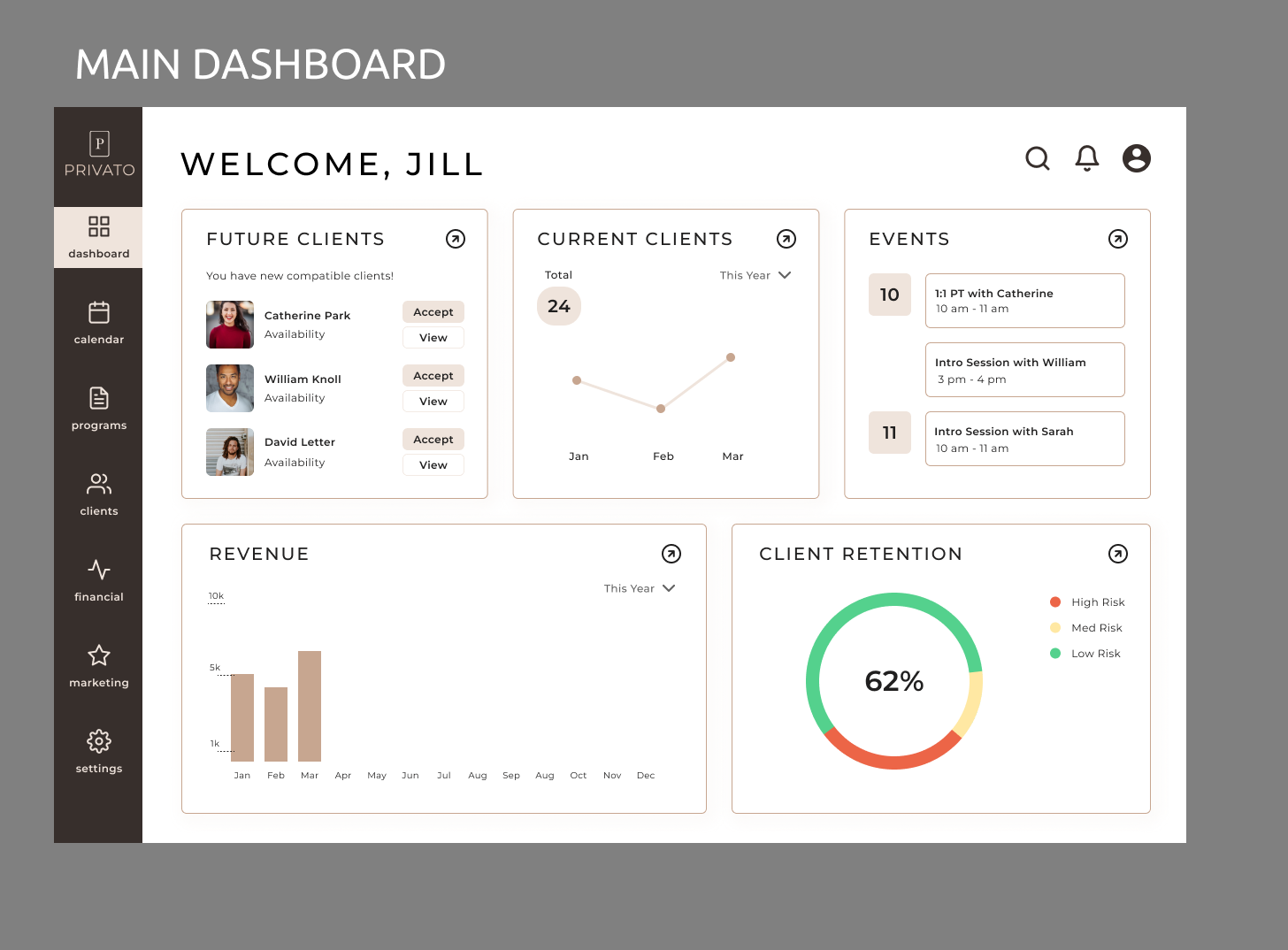
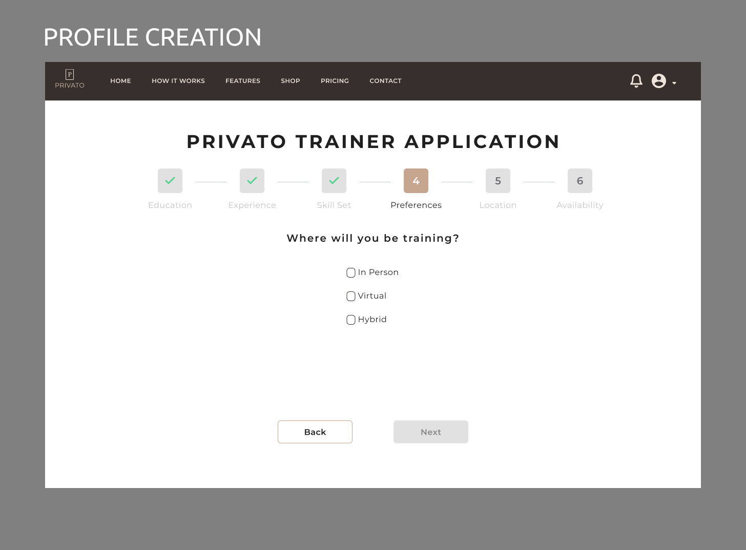
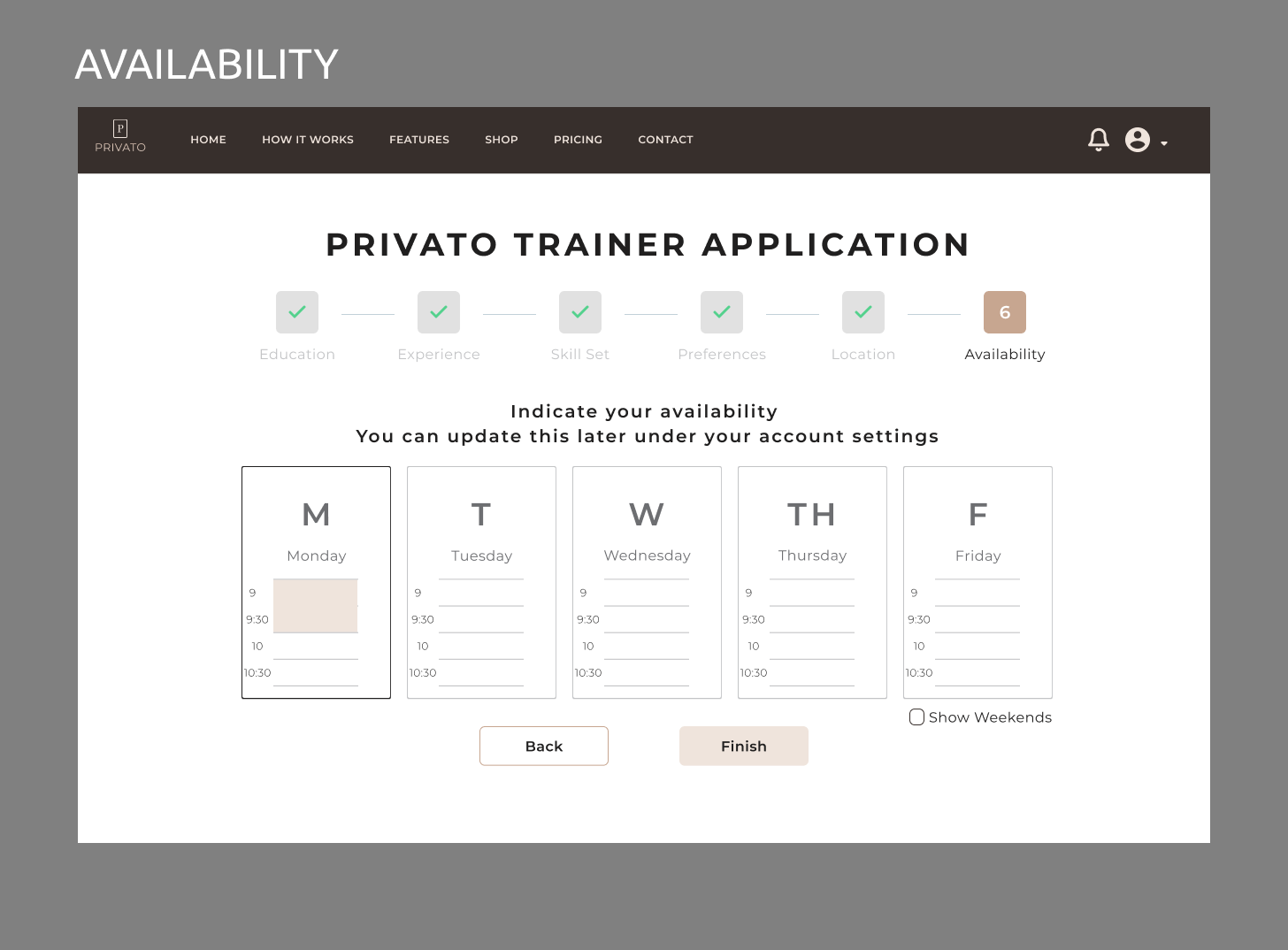
- Users would need to set up a profile immediately after creating an account, and showing progress towards creating a profile was important
- Users would be familiar with scheduling similar to Google Calendar, so we created an experience similar to that to validate during usability testing
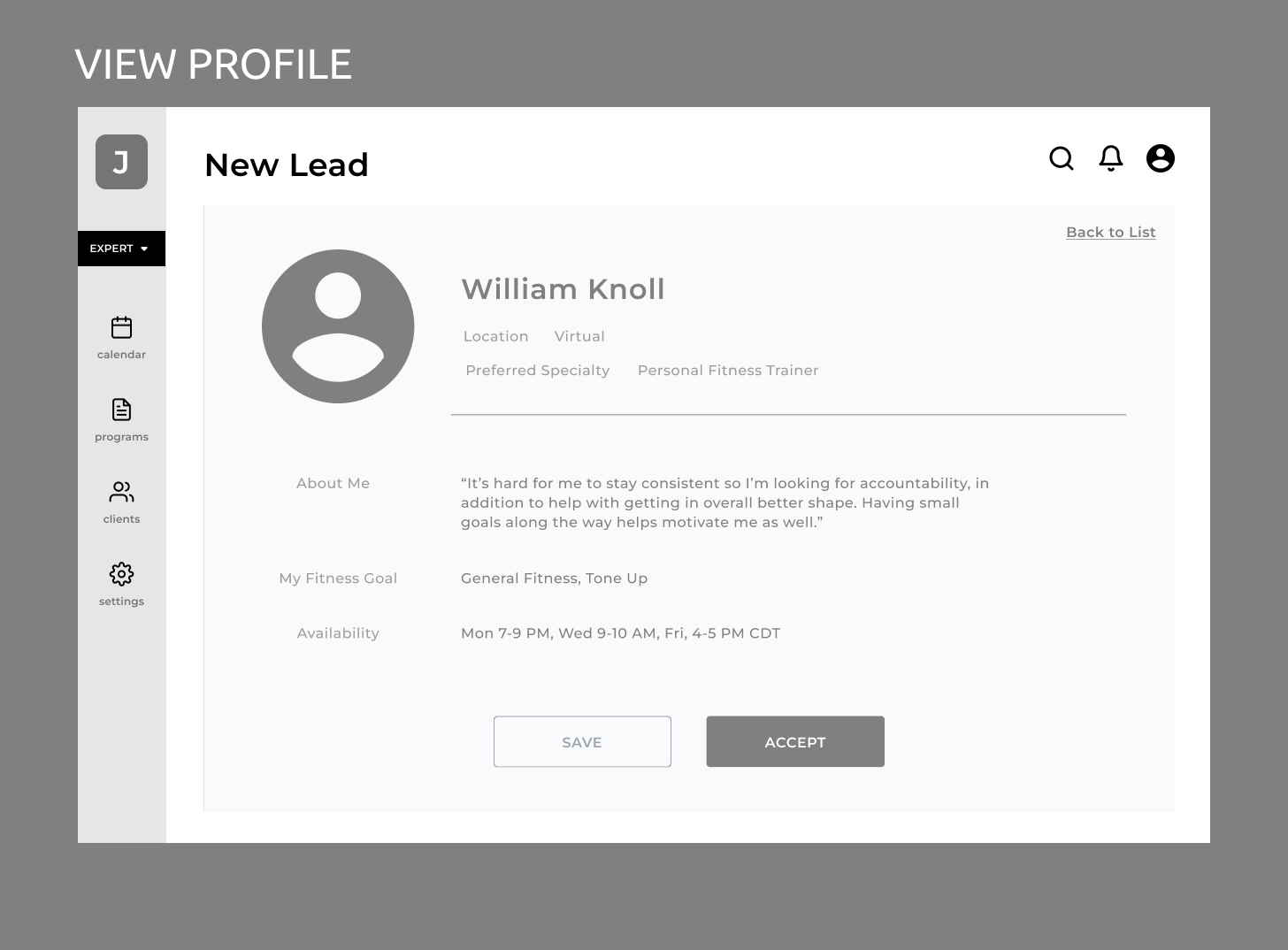
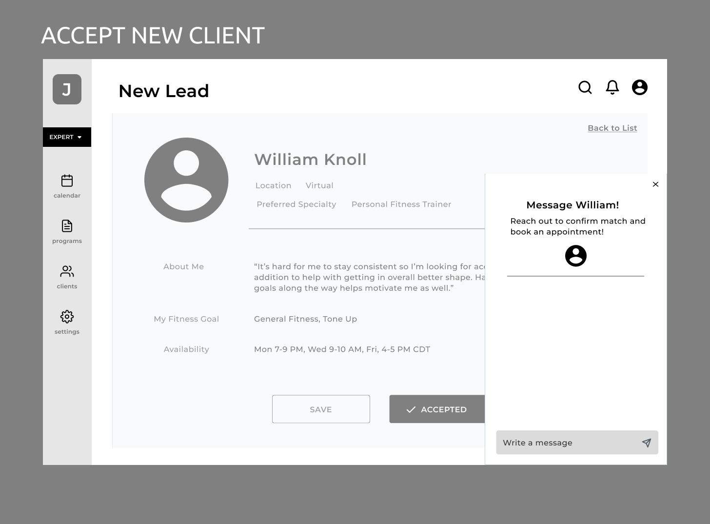
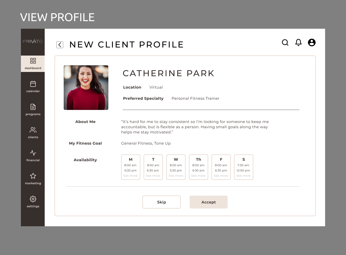
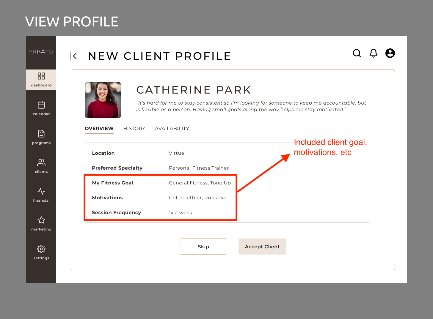
- When reviewing a new client, trainers would want to reivew needed information on some kind of profile page before fully accepting them
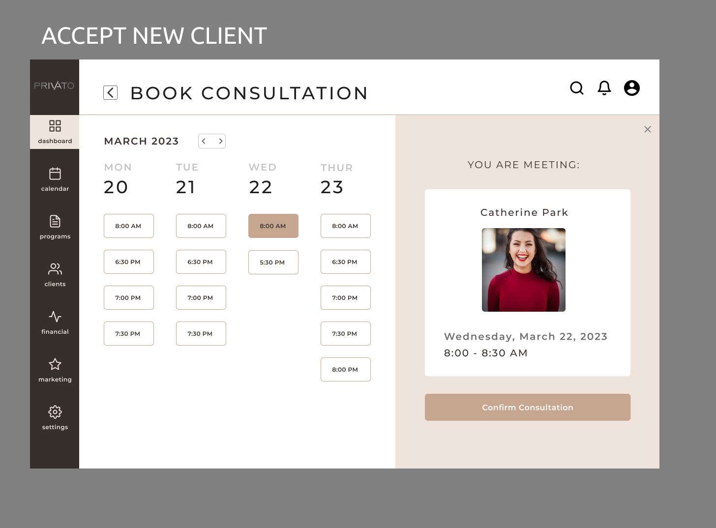
- After accepting a client, trainers would want to immediately book a consultation with them
Deliver
I created a usability test plan and script
When creating my research plan, I wanted to focus on several key goals:
- Understand if the site was usable
- Uncover usability problems with signing up for an account
- Uncover usability problems with accepting clients
- Confirm what assumptions were correct and which were incorrect
The full test plan can be viewed here and script can be viewed here.
I conducted usability testing with 3 participants
Due to time and availability constraints I was only able to conduct usability testing with 3 participants. The feedback I got can be viewed in a usability report here.
The main insights from the first round of testing were the following:
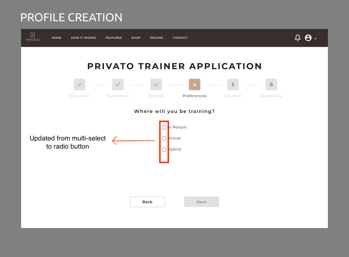
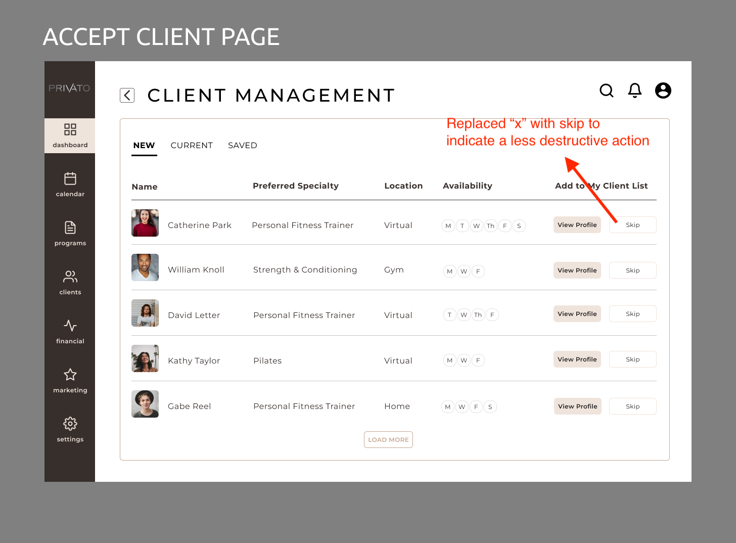
- Multi-select in some areas needs to be made a more exclusive interaction
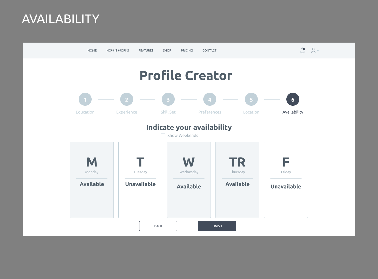
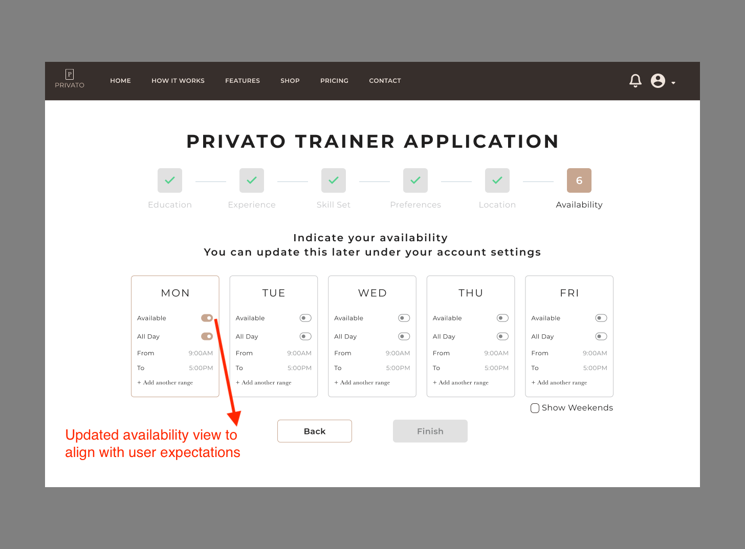
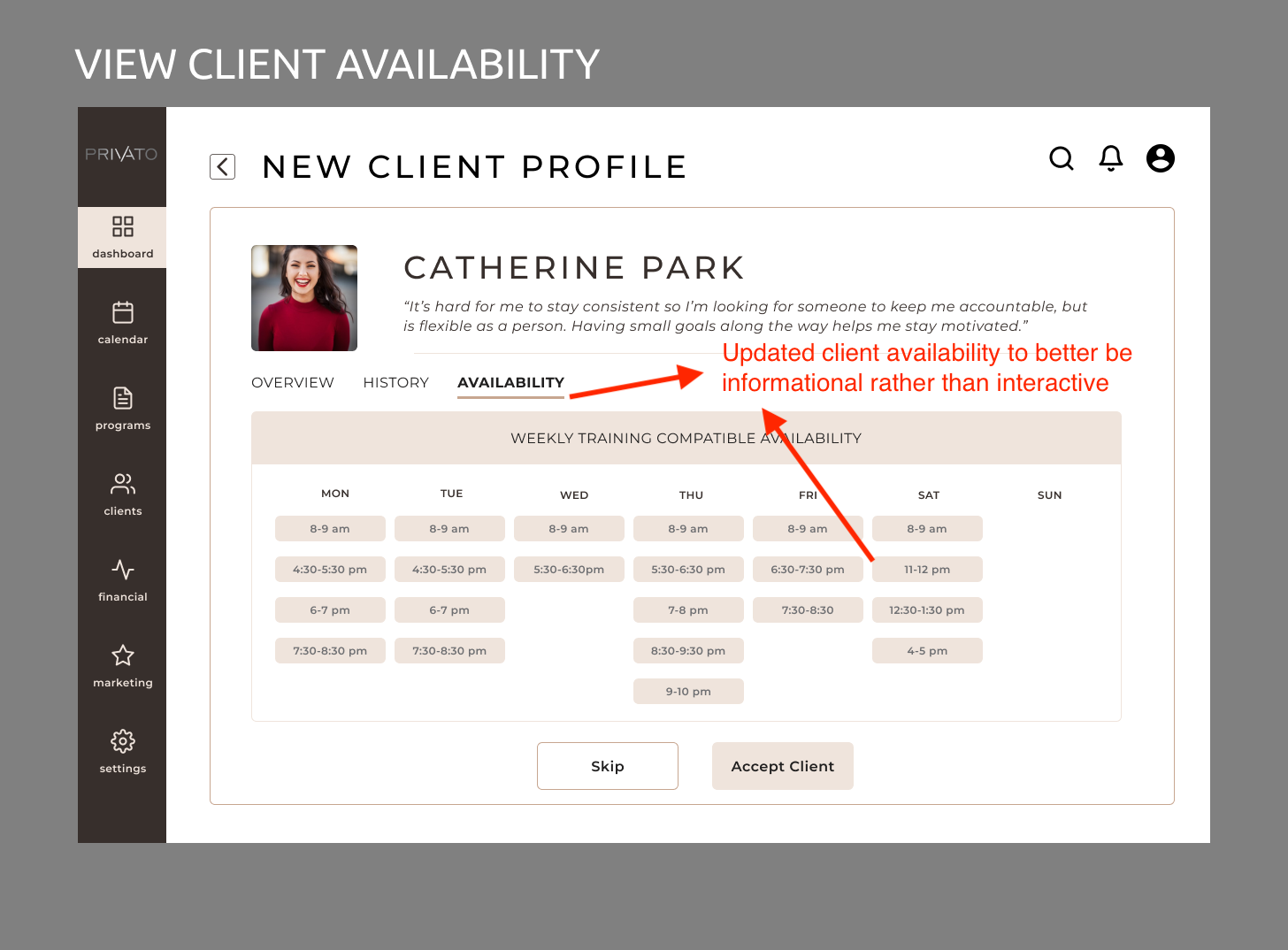
- Selecting availability was confusing and users preferred a second option we had
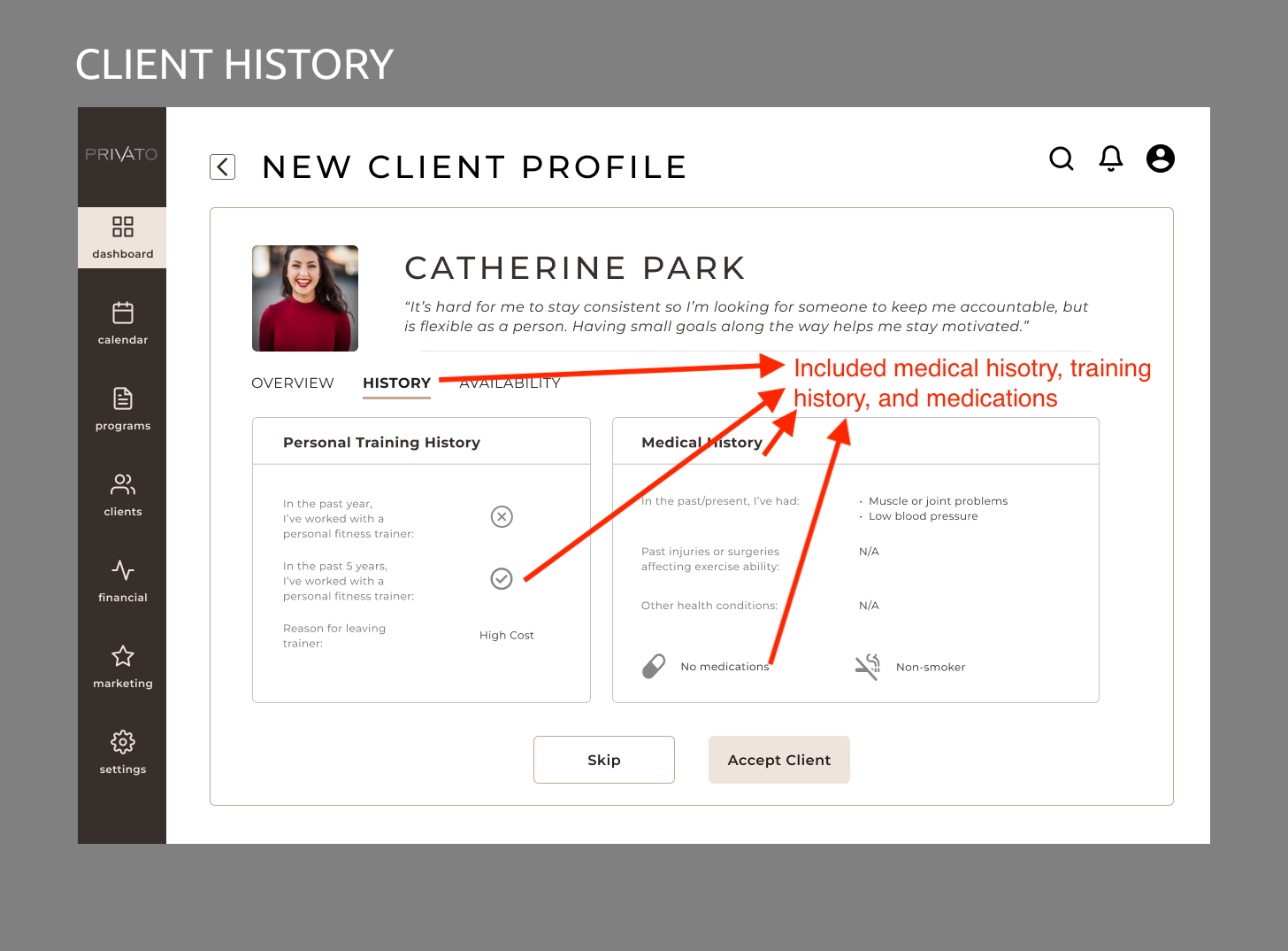
- Our client profile page was missing several crucial pieces of information: motivation and medical/training history
- Availability section on the client profile page was expected to be interactive
Possible Next Steps
If I had continued the design process with my client I would have done the following as my next steps:
- Validated that our updates from rd 1 met user expectations
- Conduct another round of user testing with these red routes with more participants to catch any possible feedback we'd missed
- Conduct more user research to validate the following:
- Validate whether availability is needed during client review step or needed after initial consultation
- Validate whether some kind of validation step for education is needed (uploading transcripts? Captcha?)
- Prioritize and iterate on other critical flows such as reaching out to the client, building client programs, or personalizing your business dashboard
Learning & Limitations
What I Learned
Below are my thoughts on what I learned during this client project:
- Because my client wasn't familiar with the UX design process in the first place, it was important to make suggestions rather than wait to be told what to do
- Everyone on your UX team has strengths and weaknesses, and it's important to let others have the opportunities they're looking for
- Communicate as much as possible. Since my client wasn't very familiar with the UX process, it was important to explain what our process was, why we were doing it, and what our client needed to do to better enable us to deliver
Limitations
Every project has its limitations, and this one is no different. I've identified some of those limitations below:
- Time and resources: this project only had a timeline of 6 weeks, and we had to navigate our design process with only free tools and not corporate level licenses. With access to tools such as Maze for user research, a corporate level Figma license, etc we might have been able to be better informed and make better design decisions
- Design-only team: this project was created, developed, and delivered with only myself and 3 other designers without input of a product manager, engineers. etc. Not having a development team to understand limitations in functionality, priority of specific features, etc was
Projects
Privato FitnessDiscovery research, visual design, design systems, user flows, user stories, data synthesis, how might we questions, usability testing
Omadi Torch-Problem Sync & performance issues, painful usability, high task completion time -Solution Only sync information drivers need, all towing types in one list, geo-tagging, consistent workflow for all jobs, interactive photos & damage reporting, mobile payments, eliminate time consuming inventory. -Role My role was as Jr. UX designer on the project. As Jr. UX designer, I owned the workflow of conducting field research with current users of the Omadi mobile platform, as well as assisted with the redesign process (visual design, user journeys, user flows, etc).
Ballot BuddyProject type
TinyTales Design SprintSpringboard
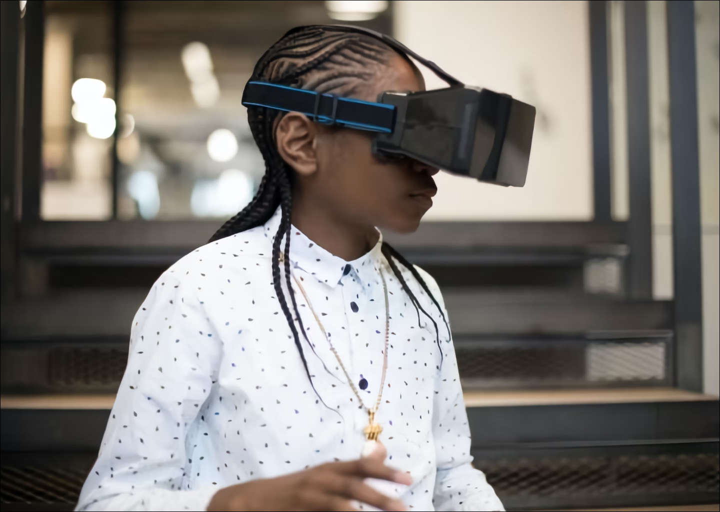
Metaverse UX ResearchProject type
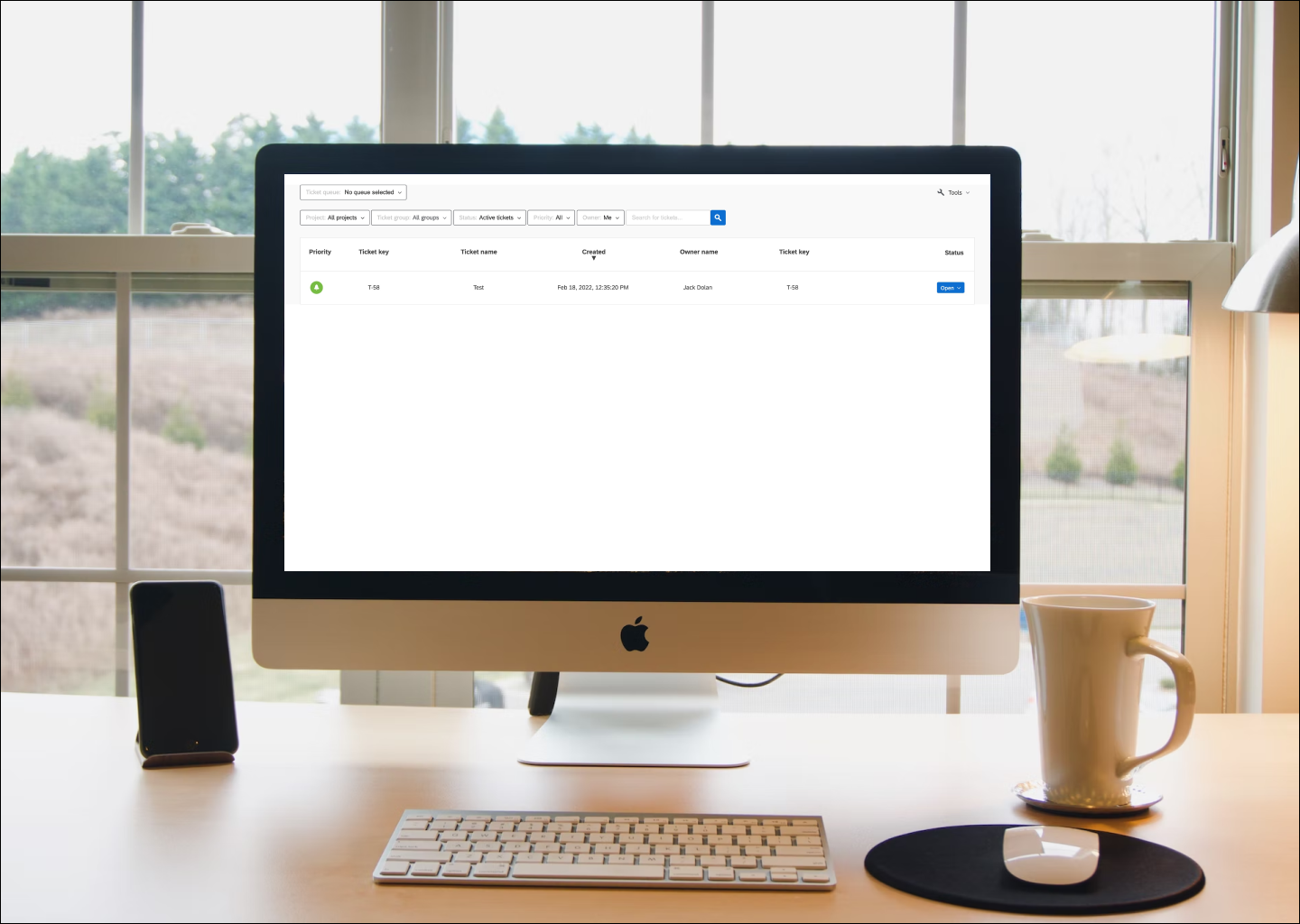
Ticket Admin ResearchProject type
© Copyright 2018 - All rights reserved