Ballot Buddy
Intro
It's a truth universally acknowledged that US presidential elections have more participation than all other elections. In the 2020 Presidential election, 66.8% of all voting-eligible citizens participated, vs 46.9% in 2022 midterms and 49.4% in 2018. Even worse is participation in off-year elections: the website whovotesformayor.org reports results mayoral participation in cities such as Dallas (6%), Las Vegas (9%) and Miami (12%) being abysmally low among voting-eligible citizens in the most recent mayoral election.
Ballot Buddy is a solution to help solve the problem of local election engagement.
My Role
As a UX Designer, my role on the Ballot Buddy Project was to implement the entire User Centered Design proecess end to end with the guidance of a Senior UX Designer.
My process followed the below methodology:
- Discover
- Problem identification, secondary research, competitor analysis, user interviews
- Define
- Research synthesis (affinity map, empathy map), user personas, How Might We questions, user stories, user flows, user journey
- Develop
- Sketches, guerrilla testing, low fidelity wireframes, style guide, high fidelity wireframes
- Deliver
- Usability testing, design iteration, re-testing
Discover
Problem Identification
I wanted to focus on an experience that has always caused me frustration: becoming informed on elections before voting in them. Since I had experienced frustrations with data collection, data quality, etc in my own voting experience, I assumed this wasn't an anomaly just to myself but needed to conduct research to better inform that assumption.
Secondary Research
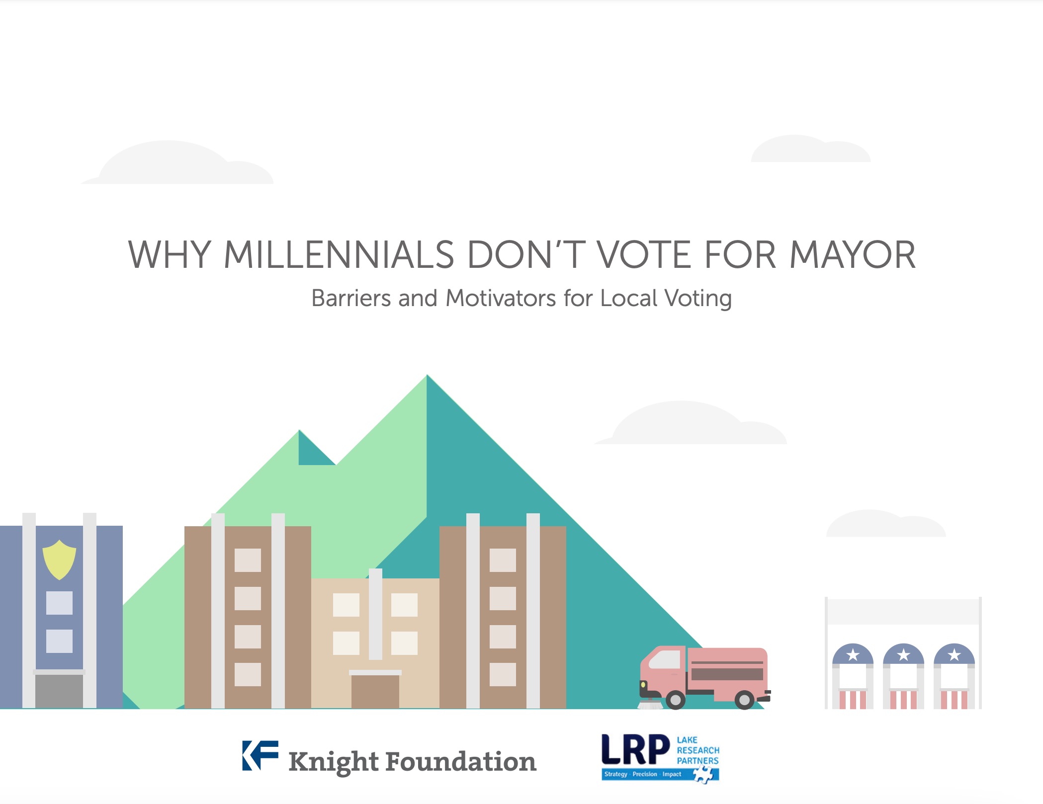
My research found that voting in the US is a pain for others, especially in local elections. A study by the Knight insitute in 2014 identified that millenials in particular don't typically vote in local elections. Lack of local engagement centered around the lack of information available to use when participating in local elections.
Additional research revealed that the median age of voters in local elections is 55 years old, and in off year elections, only 20-25% of voter-eligible Americans in the top metropolitan areas in the US participate in local elections.
I now knew that my assumption was correct: local voter engagagement was a problem, with access to information (or lack therefore) identified as a major factor.
Competitive Analysis
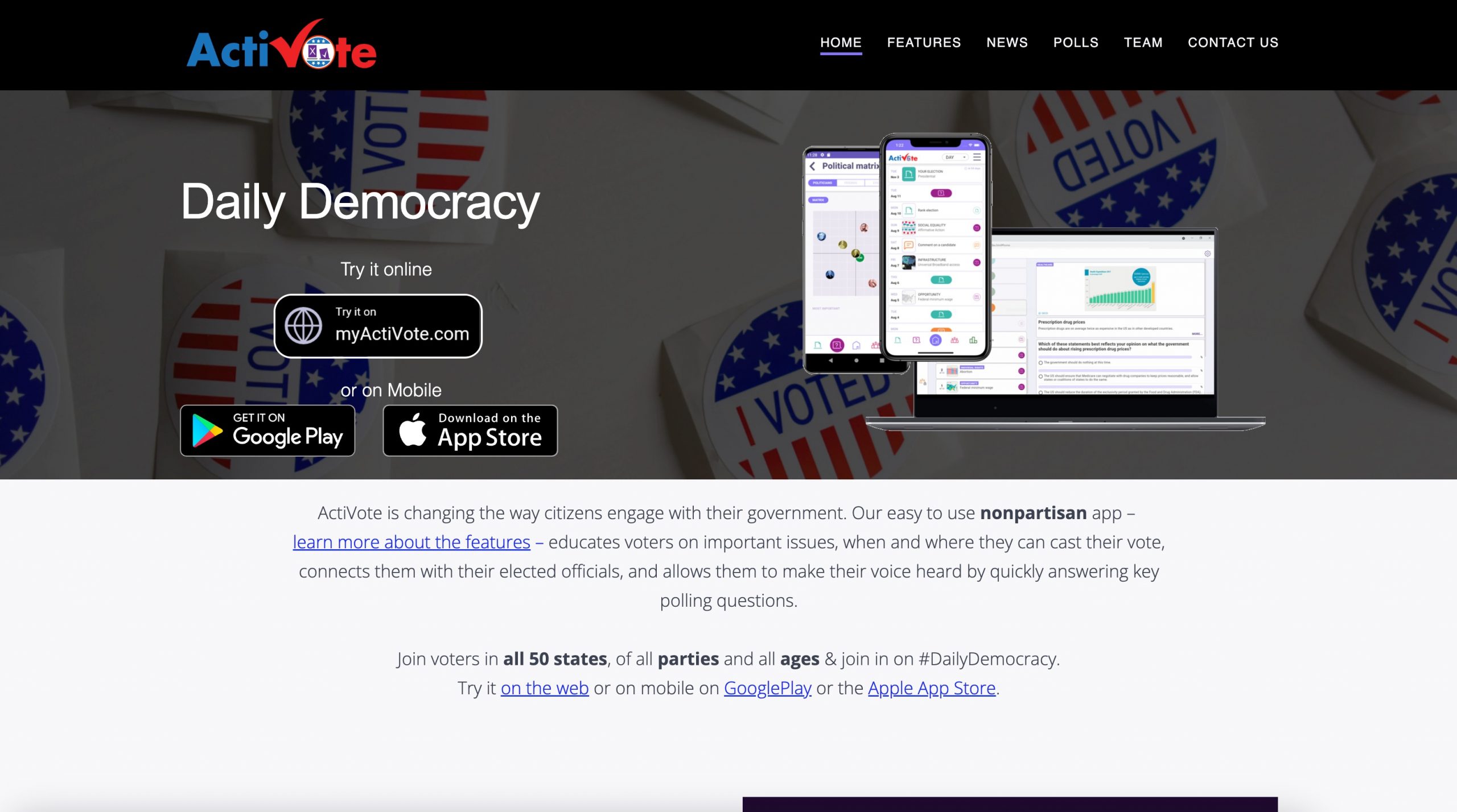
I did a heuristic competitive UX analysis to determine what other solutions had already been created to solve the voter engagement problem. The full analysis document can be found here.
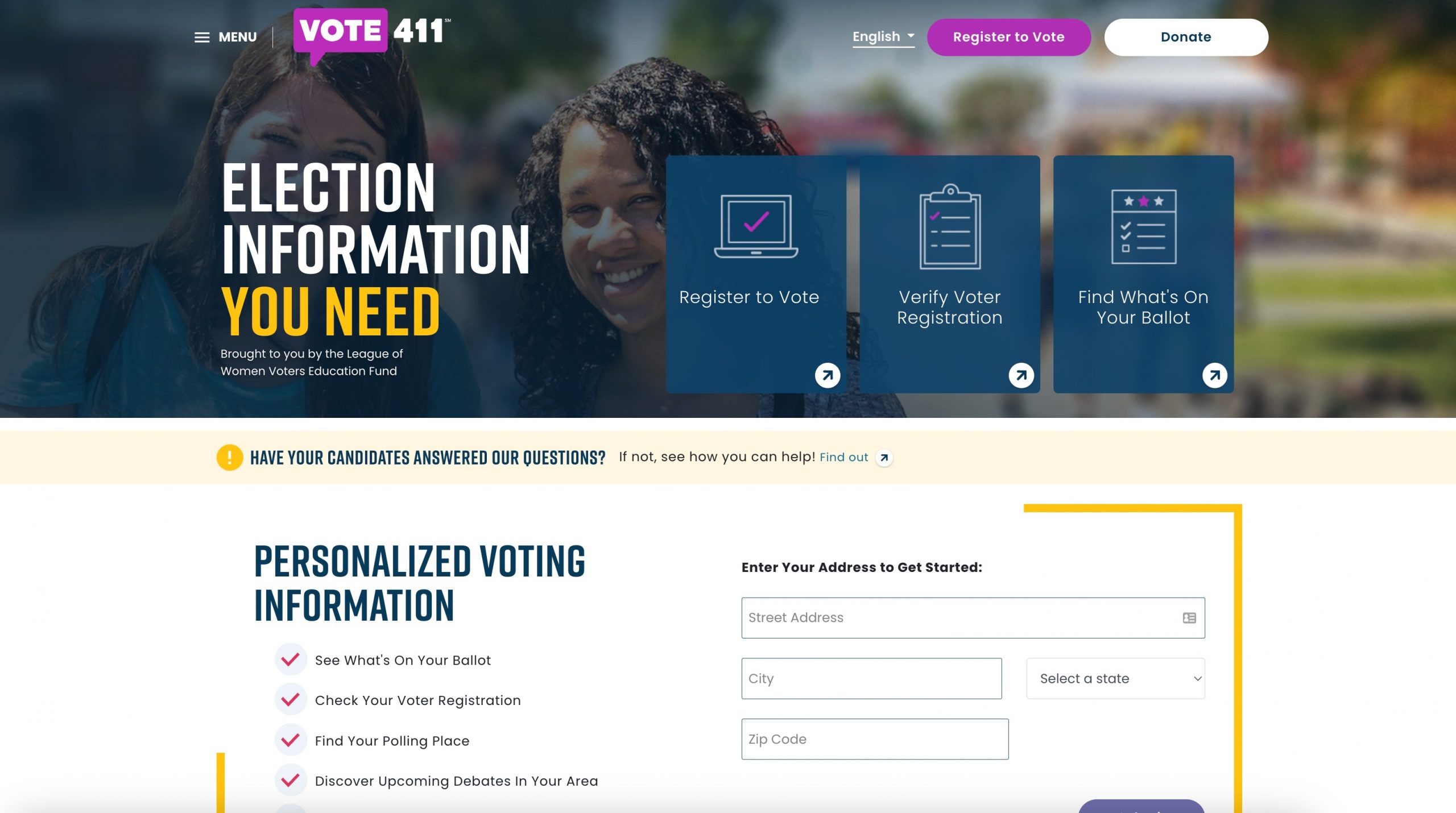
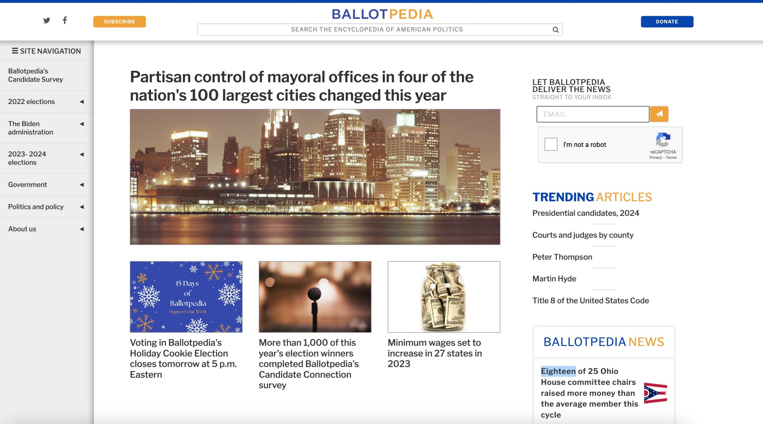
My analysis focused on the websites Ballotpedia, Vote411, and Activote, and focused on 3 of the 10 design heuristics determined by the Nielsen Norman group:
- Aesthetic & Minimalist Design
- Match between system and the real world
- Help and documentation
The results indicated that all three competitors do moderately well in those three areas, but all lack in the "Match Between System and the Real World" aspect. This needed to be something my solution did really well in.
Generative Research
I needed to talk to voters to understand the problem space more. To accomplish this, I determined to conduct user interviews with at least 5 voters.
Screener Survey
I created a screener survey to recruit participants for my qualitative research. I identified the ideal participant as a user aged 18-55 that hadn't participated in local elections due to frustration with voter data collection.
I received 39 responses to my screener, and scheduled interviews with 5 participants of the 15 that indicated their willingness to speak with me.
User Interviews
I used the individual survey responses as my guide to conducting the interviews. Participants' frustrations echoed much of the secondary research I had already conducted: voting is a painful process, the current information available for elections isn't always accurate or reliable, and citizens want to vote but don't because of their pains.
Full transcripts of every interview can be found here.
Define
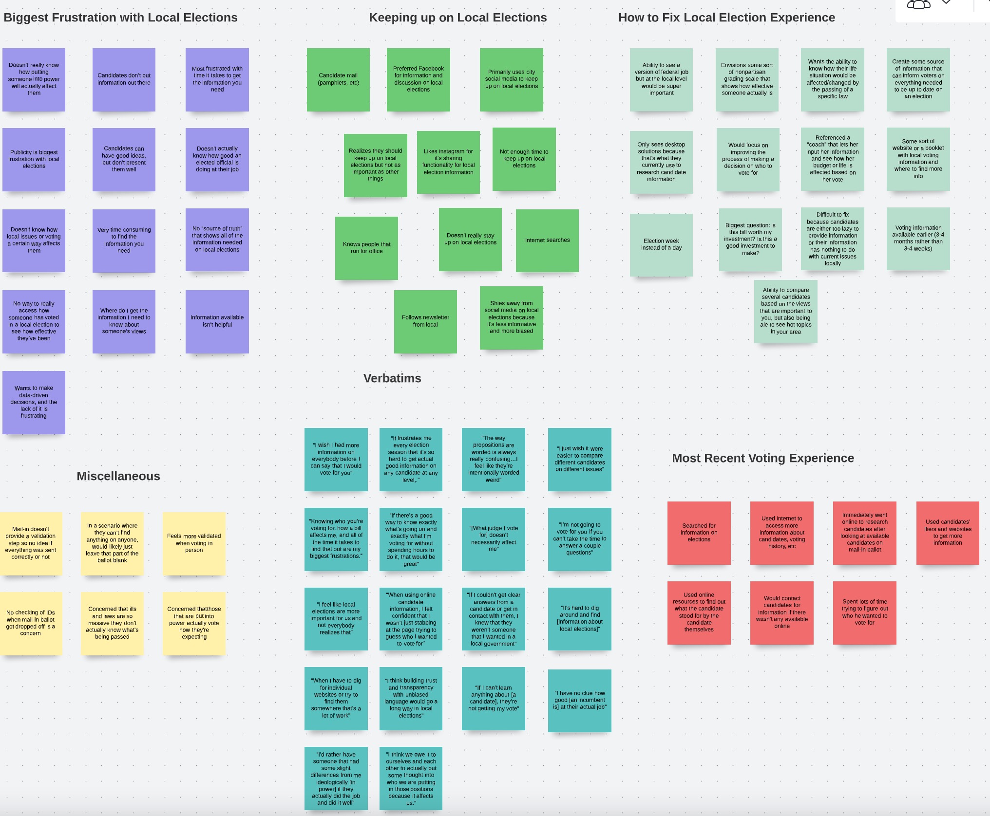
Affinity Map
I created an affinity map to see how the different comments in each interview were related. I started by grouping comments by the individual participants, and then began the process of grouping the ideas and comments by shared theme.
I learned there were three key insights from this exercise: voters want to use information to be informed but are frustrated by its quality/quantity, voters don't understand how their vote impacts them, and voters feel a lack of trust in elected officials. My solution needed to help improve these three key areas.
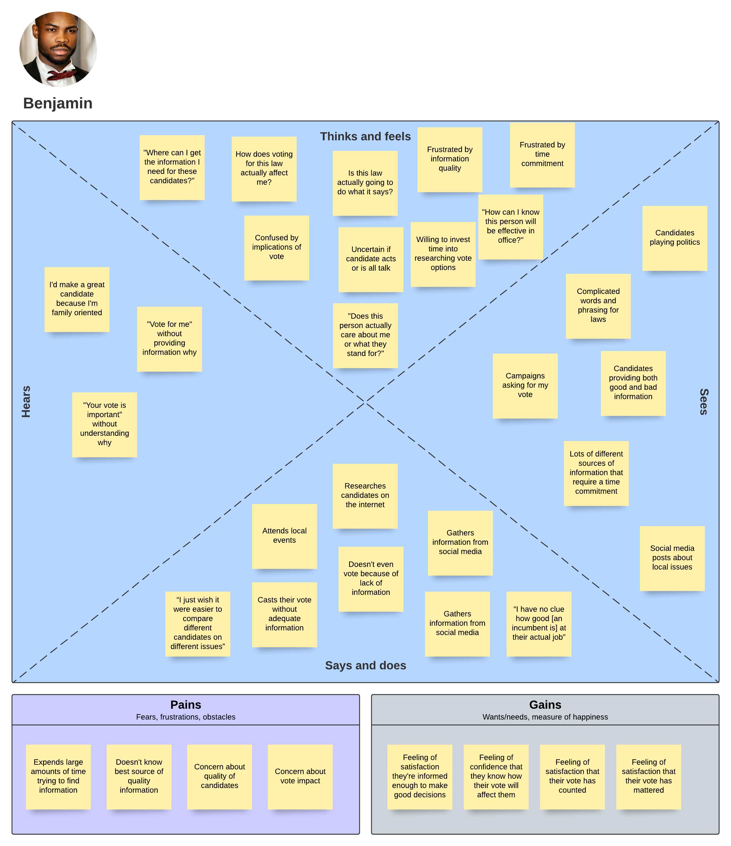
Empathy Map
I created an empathy map organizing my affinity map information into more of a user-centric lense. I was able to see that the problem space was present in all aspects of the human experience: there was uncertainty, frustration, and time-consuming processes in all human aspects. This further confirmed the depth of the problem space and that I needed to focus on time consuming issues and increase user confidence.
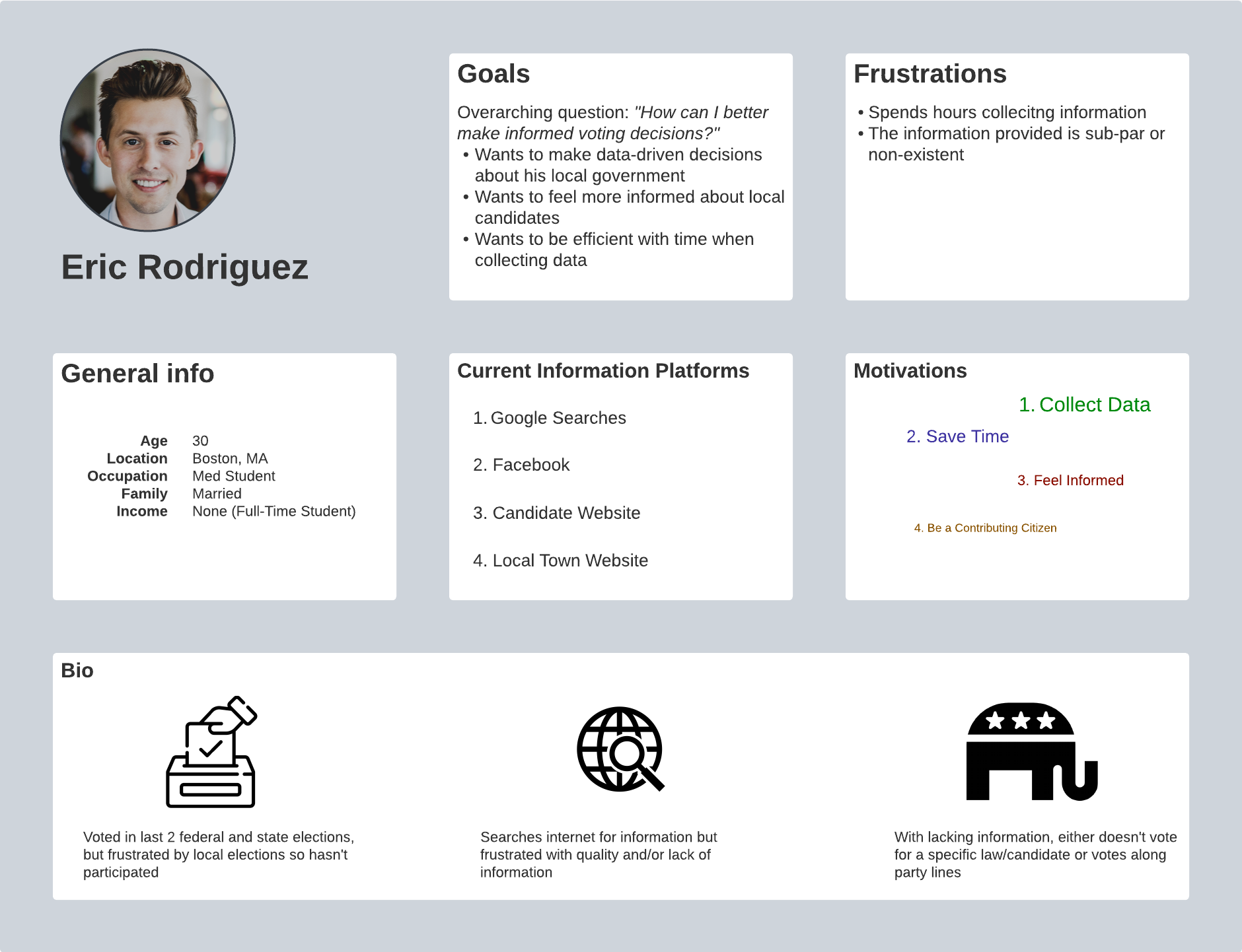
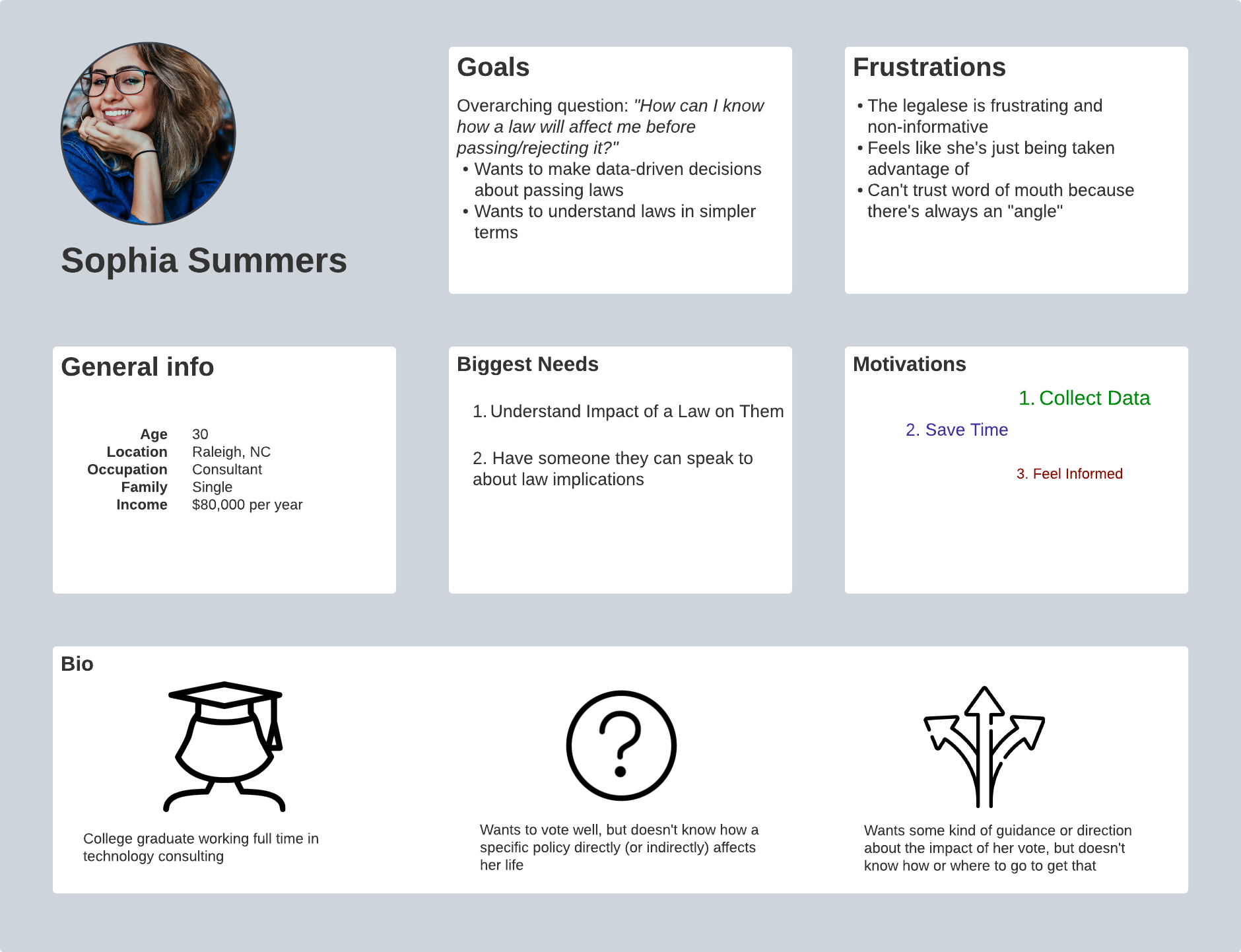
Personas
My research showed that millenials (and anyone younger than 55) were my target audience, so my users were younger American citizens wanting to make a difference in their community, but encountered enough frustrations and obstacles when trying to become informed that their expectations weren't met.
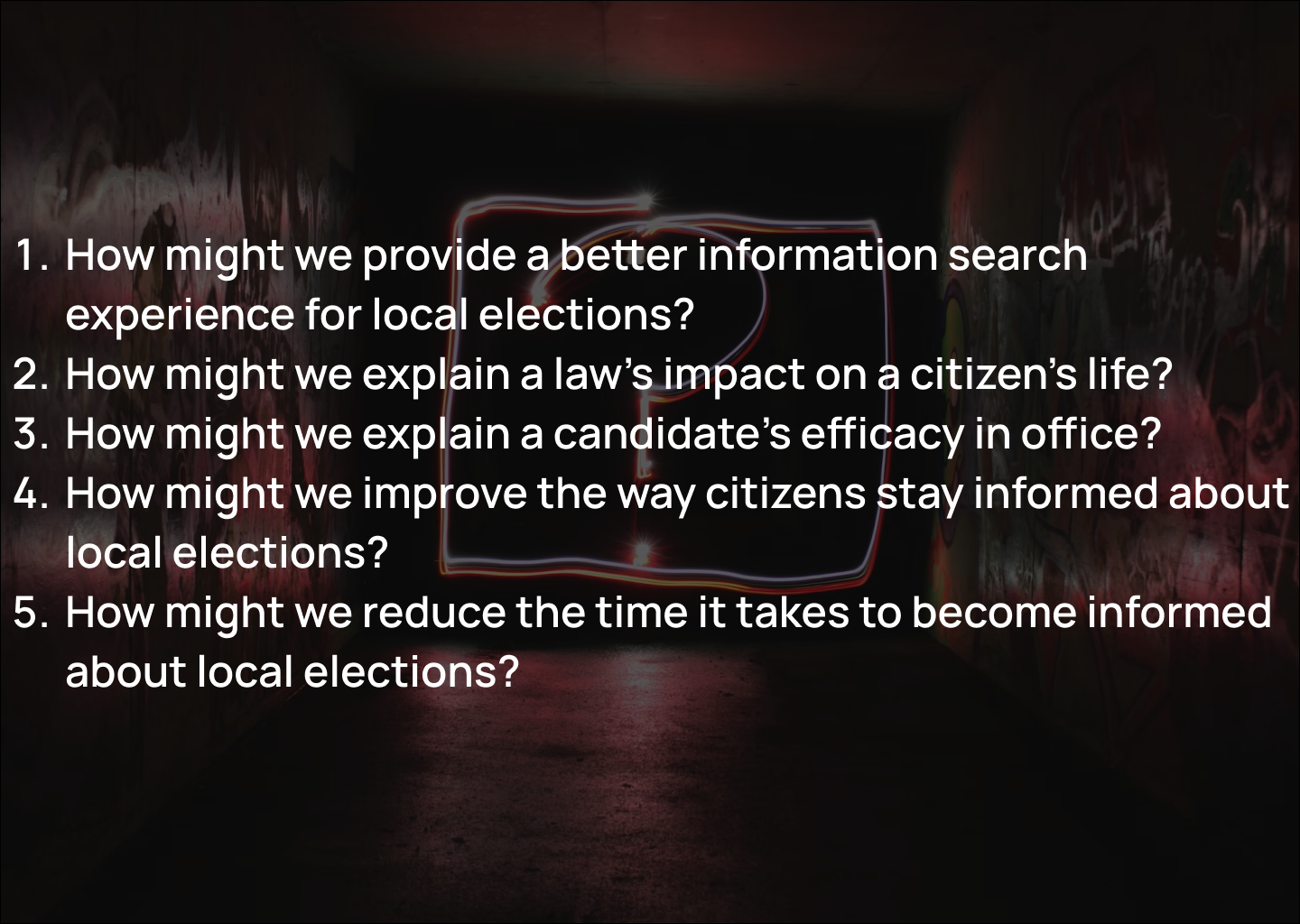
HMW Statements
To this point I'd learned about the painful experiences of people in the voting process, but I created several HMW statements to focus my solution efforts as I moved into creating a solution for these people
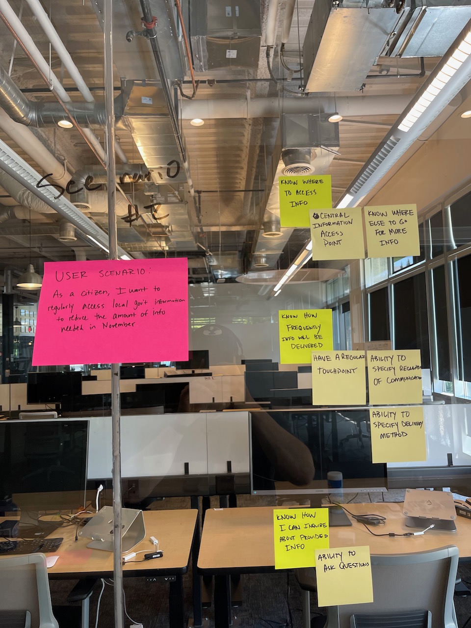
User Story
Using the HMW statements as a guide, I wrote out user stories based on specific scenarios found in my user research. This would help break up the development of this solution into individual pieces that could be iterated on quickly.
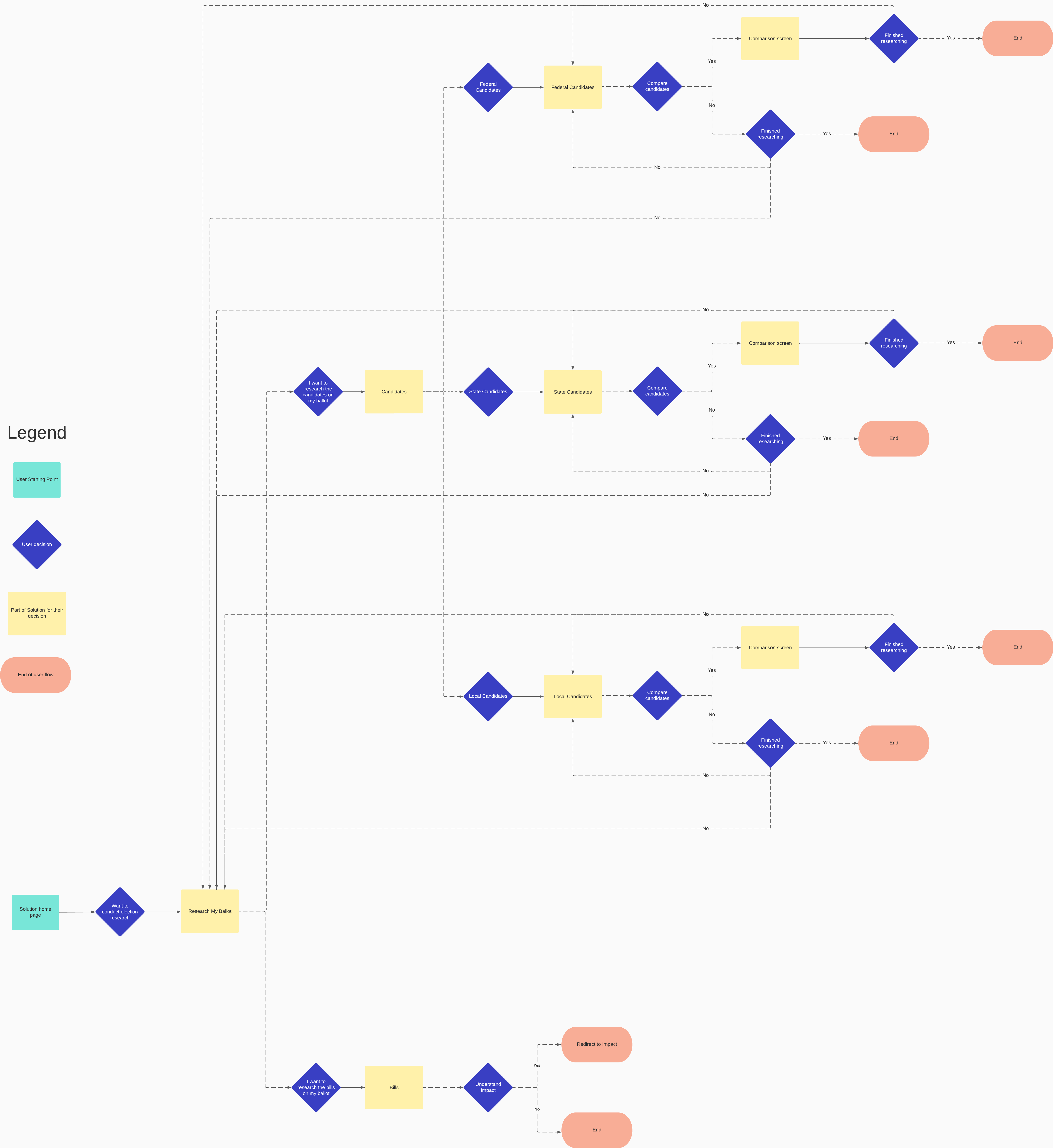
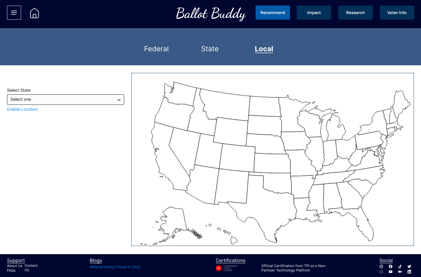
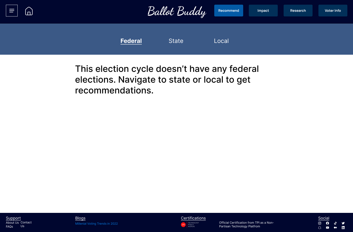
User Flow
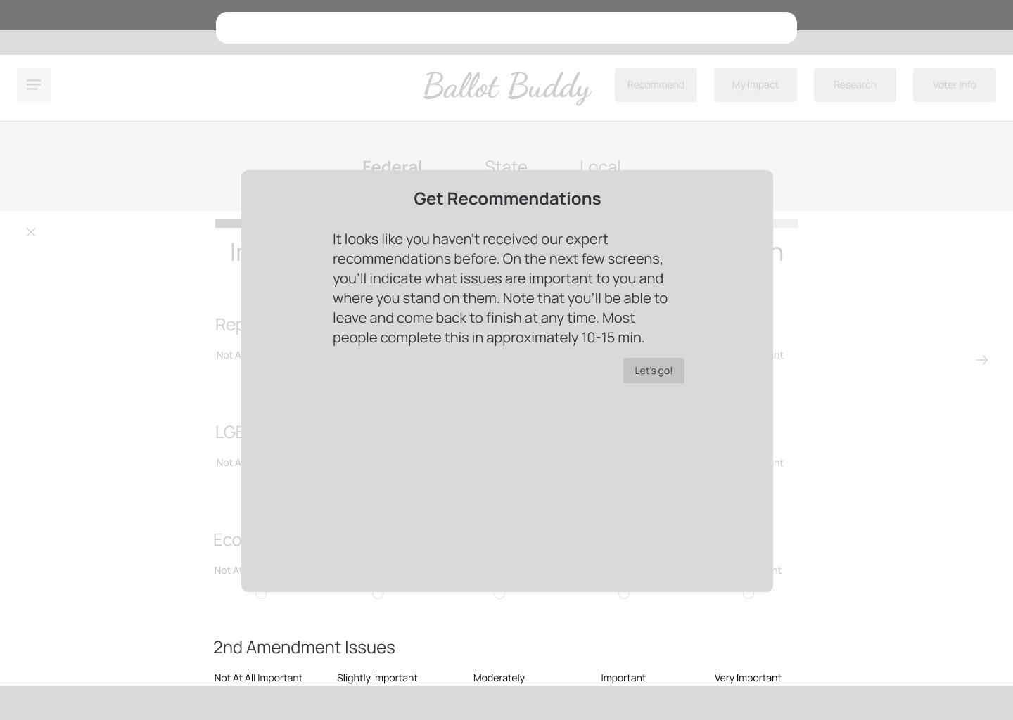
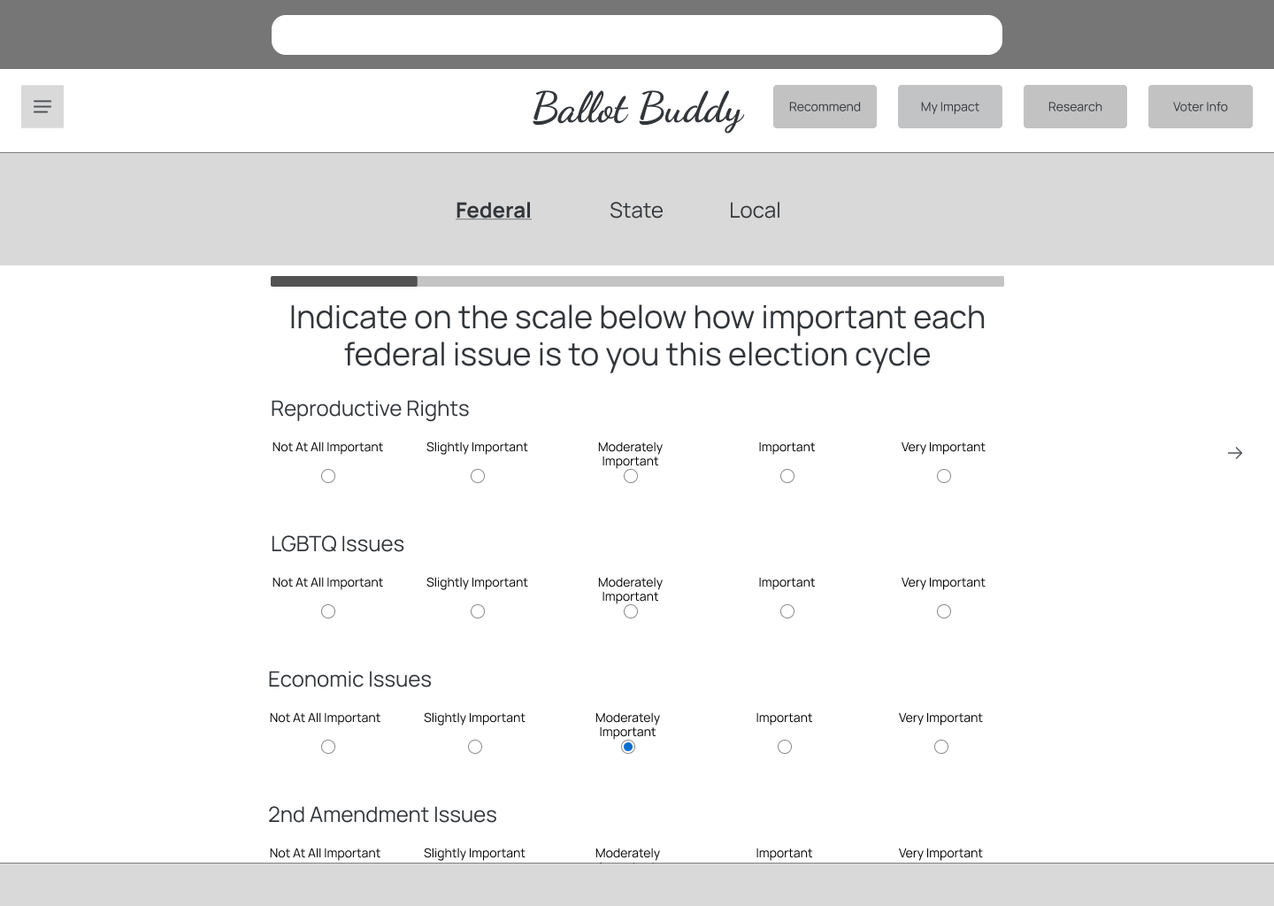
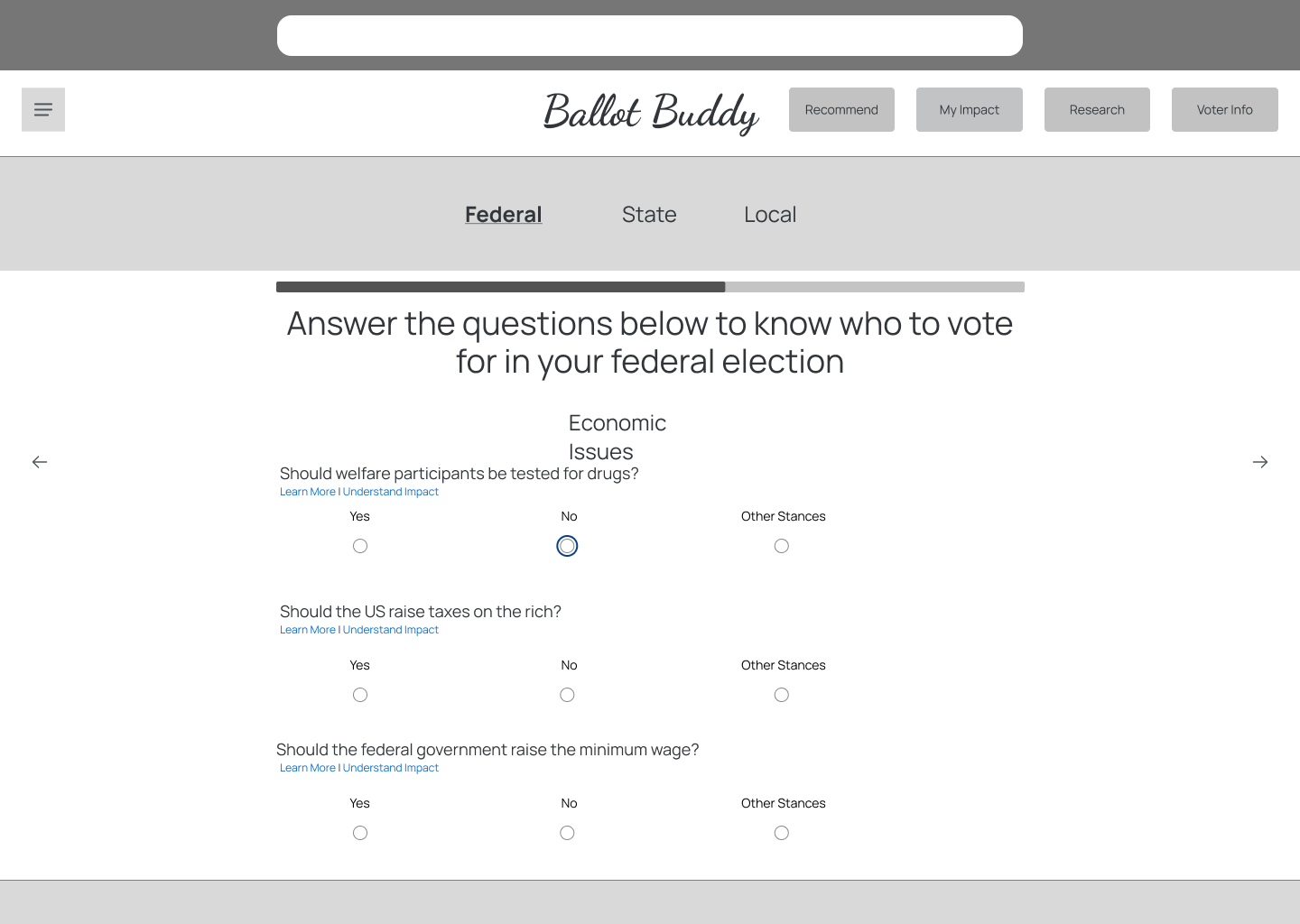
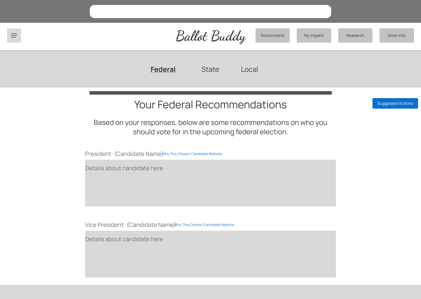
I next identified 4 specific red routes that would be critical for a solution to have in order to provide value in the problem space:
- Gathering general election information (location, when to vote, etc) because it allowed voters to feel informed and know how/when to take action
- Understanding a bill's impact because of the insights I'd received about how voters not understanding how their vote for a bill impacts them
- Researching a bill or candidate because this allowed users to accomplish their goal of wanting to use information to be informed
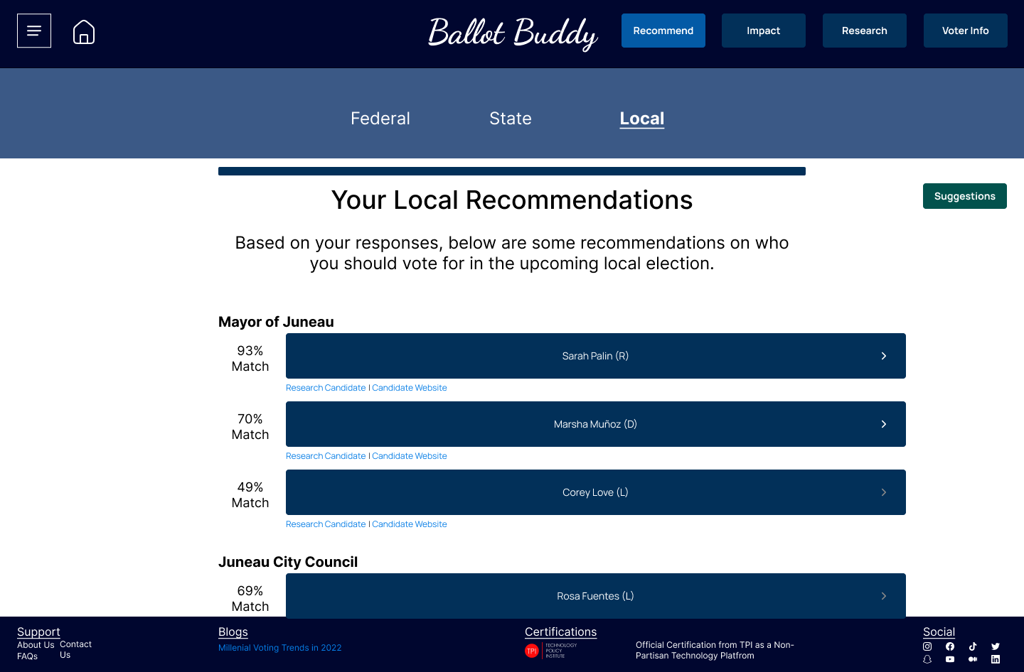
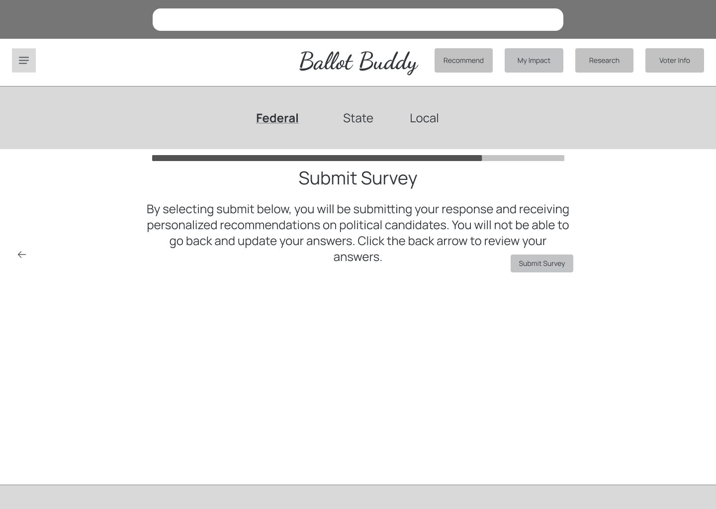
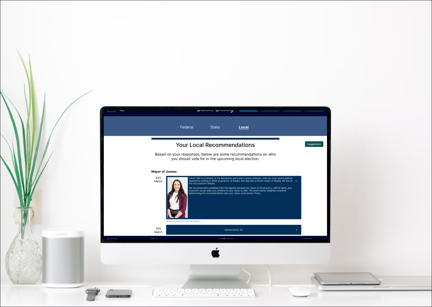
- Receiving voter recommendations because voting being a time consuming process was present in my research, and providing a way for someone to make decisions for the voter would accomplish this.
Design
Low Fidelity Wireframes
My research indicated that this solution should be a software platform on desktop because users expected to sit in front of a computer with their ballot and beging using Ballot Buddy. With this in mind, I started designing some low fidelity prototypes in Figma. I started with low fidelity for speed: I wanted to create a solution and validate those designs as soon as possible.
One important note about my design process: due to time constraints I wasn't able to explore multiple possible solutions for each design.


Guerrilla Testing
I conducted guerrilla testing with 4 participants, which revealed the following feedback:
- Parts of the platform were usable and intuitive, but it truly
- My current iteration didn't convey trust and transparency.
Participants consistentally talked about how they "didn't know who recommendations were coming from" or "where information was coming from," so I needed to make sure to account for this in the next iteration.
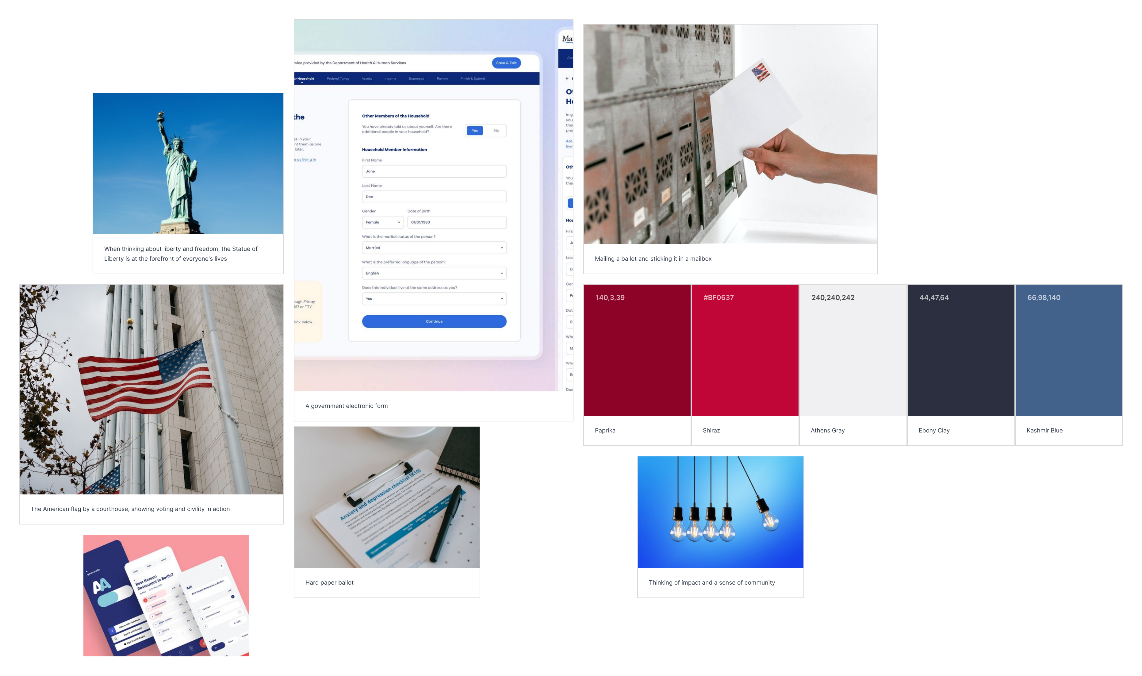
Mood Board & Style Guide
I created a mood board using inspiration such as voting ballots, the American flag, the Statue of Liberty, and a Red, White & Blue color palette. The overall theme of democracy, civic engagement, and trust needed to come out in the design.
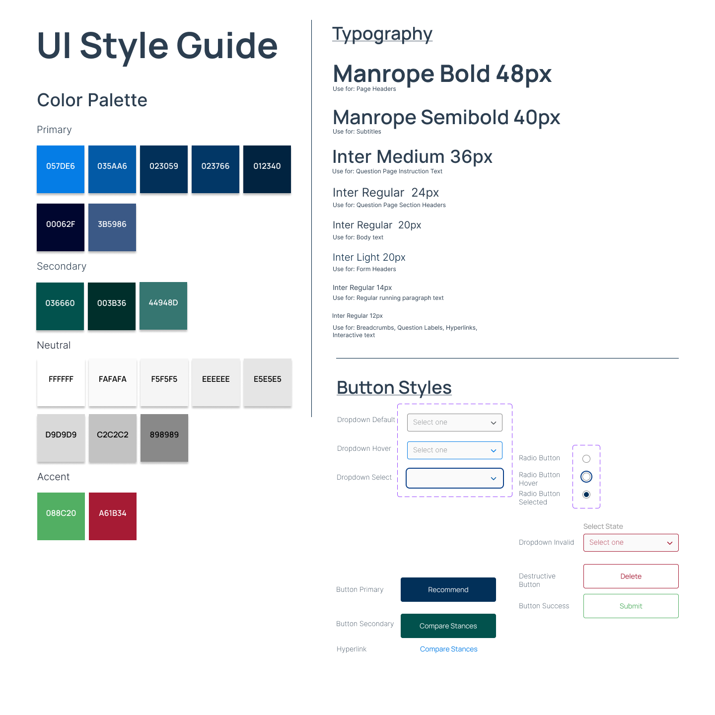
After creating a mood board, I decided to use a blue as my primary color to convey trust and have a calming effect because both of these points had come up in my discovery research: users needed to trust the solution and also feel at ease when using it.
Since I was creating a desktop solution based on feedback I'd received in my discovery research, I implemented some Material Design principles of shading and color accents to finalize my style guide. I decided on the Manrope font because it conveyed friendship and trust, and because I wanted to take advantage of modern design trends to assist with user trust and sentiment, I went with a second font for body text in Inter.
High Fidelity Wireframes
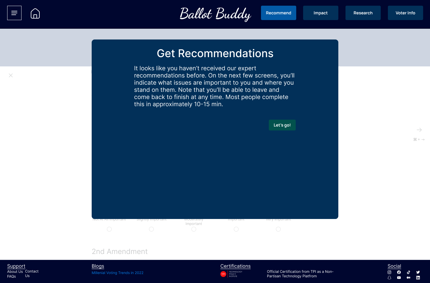
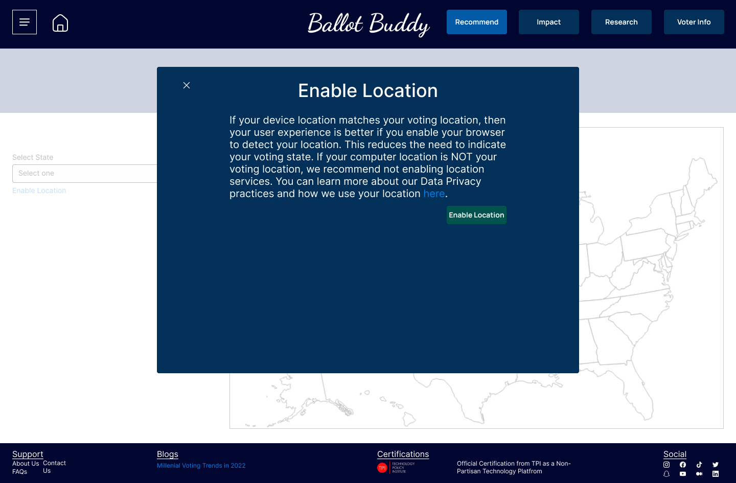
I created a more detailed footer because I wanted to see how it affected users' trust with information about being a certified non-partisan platform, blogs about trust, etc. This was because of feedback I was receiving during my guerrilla research conveying a need for users to feel trust and have transparent communication about the platforms' practices and behavior.
Deliver
Usability Test Plan & Script
I needed this to be more formal to test the red route scenarios I'd identified while creating my user flows. I set the following objectives for my usability test:
- Understand Initial impression of site
- Uncover usability problems with conducting research on site
- Uncover usability problems with getting recommendations from site
- Uncover usability problems with understanding a bill’s impact from site
- Uncover usability problems with accessing your voter info from site
With my objectives set, I fleshed out my full test plan with questions, tasks, recruiting method and timeline, and script. The full test plan can be viewed here and script can be viewed here.
Usability Testing Rd. 1
For my first round of testing had 5 participants, with one being unmoderated. This was to better meet necessary timelines and also to collect qualitative feedback from my moderated tests.
3 of 4 users completed all tasks successfully, with one user not able to complete all tests due to prototype issues.The main insights from the first round of testing were the following:
- Adjust constrast ratio because the text and background colors didn't mesh
- Add more and better images because this needed to be an engaging user experience, and a lack of pictures didn't create that
- Adjust "understand impact" interaction to better meet user's expectations because this was called out multiple times as not meeting their expectations
- Improve how the platform communicates transparency. This was touched on multiple times, but at least for this round of testing, wouldn't be iterated on.
Feedback & Updates
I made updates to my Figma prototype to include more images, improve the color contrasts, and improve the interaction design to meet users' expectations. Users expected to have a more "percent match" experience when receiving recommendations, and also expected to see photos of the candidate when interacting with the platform, so those updates were the primary focus of my updates.

Usability Testing Rd. 2
I tested again with another 5 participants: 3 unmoderated and 2 moderated. I chose to do 3 unmoderated sessions due to time constraints and also because I wanted to evaluate how usable the solution was without a moderator there to help.
4 of 5 users completed all tasks successfully, with the one failure due to an issue with the prototype. Next steps from the second round of testing would the following:
- Do A/B testing on the voter info page. There was varied feedback of what users expected here, and I would want to create another separate experience and conduct testing to see which experience was preferred.
- Evaluate why I ask users to create an account on the platform because of the following participant comment: “Why should I create an account? This information is already public, so why do I need to create an account to access that?”
- Do more rounds of testing focused on other features viewed in the prototypes. Most users wanted to interact more with the site to see how it met or exceeded their expectations.
Learning & Limitations
What I Learned
Below are my thoughts on what I learned during this capstone project:
- I LOVED the interaction design and data synthesis aspects of my capstone. I enjoyed creating designs but also enjoyed focusing on users and how my designs would meet users' expectations. I also loved the data synthesis pieces of the project because of the holistic view it gave me into the problem space and being able to analyze themes and topics was awesome.
- I CAN be a UX designer. I've needed to move into the mindset from "doing UX design" to "being a UX designer." My capstone helped me see how I can succeed in this field and actually be a UX designer, not just do UX design.
- Be consistent. I needed to consistently work on this project and not give up, even though adversity came up in the form of full-time job priorities, sickness, travel, etc. It was my job to consistently make progress, and I did so without giving up!
Limitations
Every project has its limitations, and this one is no different. I've identified some of those limitations below:
- "Design in a vacuum:" this project was created, developed, and delivered with only myself as the development team. I had no platform or system limitations to navigate, no project members to work with, and no business requirements to think of.
- Design critique: I had no way to receive feedback on the designs I created during a formal design critique with my UX teammates
Projects
Privato FitnessDiscovery research, visual design, design systems, user flows, user stories, data synthesis, how might we questions, usability testing
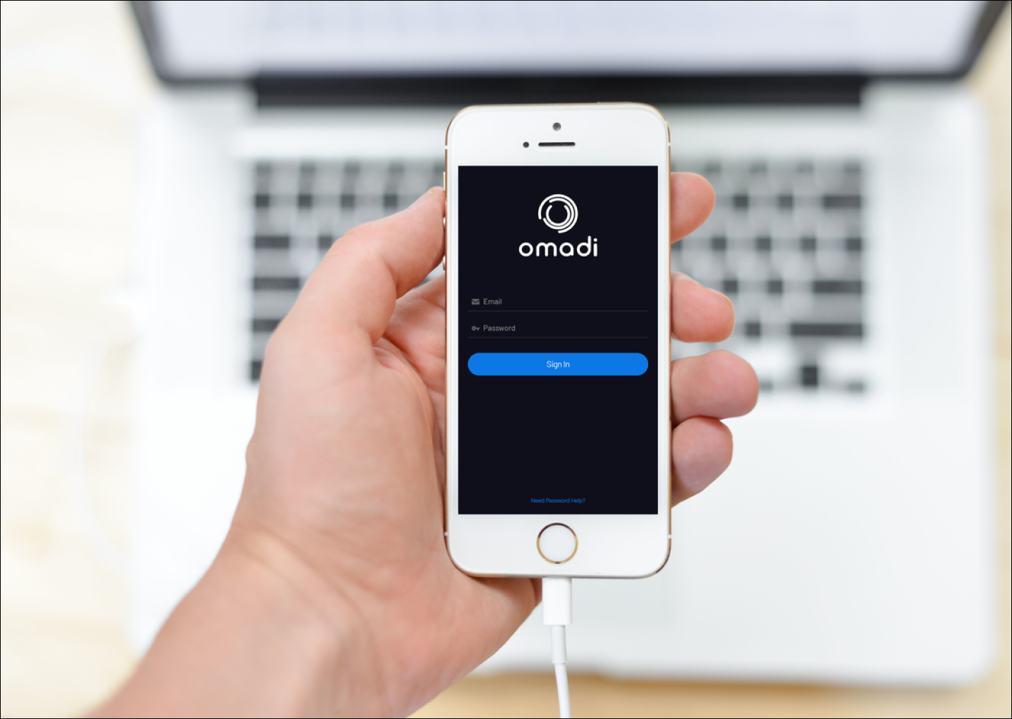
Omadi Torch-Problem Sync & performance issues, painful usability, high task completion time -Solution Only sync information drivers need, all towing types in one list, geo-tagging, consistent workflow for all jobs, interactive photos & damage reporting, mobile payments, eliminate time consuming inventory. -Role My role was as Jr. UX designer on the project. As Jr. UX designer, I owned the workflow of conducting field research with current users of the Omadi mobile platform, as well as assisted with the redesign process (visual design, user journeys, user flows, etc).
Ballot BuddyProject type
TinyTales Design SprintSpringboard
Metaverse UX ResearchProject type
Ticket Admin ResearchProject type
© Copyright 2018 - All rights reserved