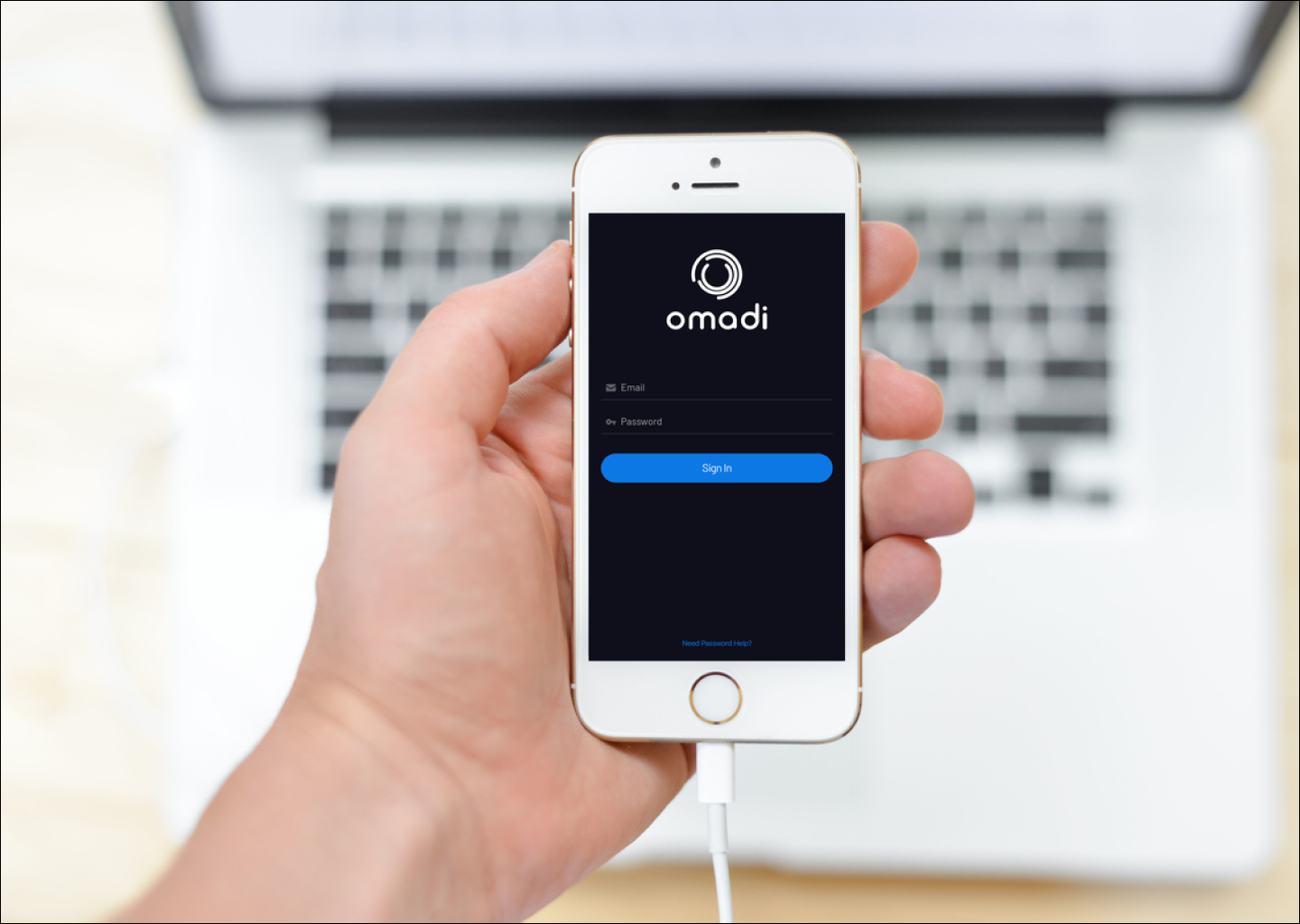
Omadi Torch
Intro
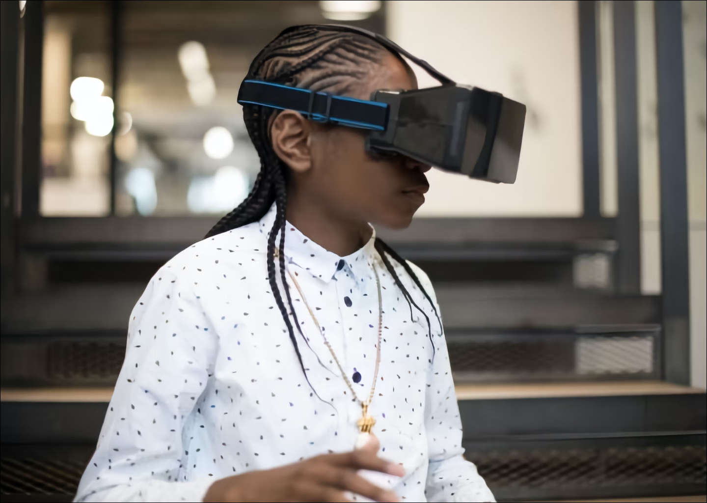
As recently as 2013, towing operators used archaic modes of communication like paper invoices and phone calls, causing the loss of thousands of US man hours. To improve efficiency, engineers at Omadi Mobile Management created the Towing Management Service (TMS) platform in 2014, which allowed towing companies to manage leverage technology to pinpoint tow jobs, manage their tow truck drivers' locations. etc.
Although usable and helpful, TMS users never ceased to complain about their pains with the mobile platform, ranging from app crashes and data loss to navigation frustrations and usability concerns. Our engineering team tasked us with a redesign of the mobile platform to solve these frustrations, labeled project Torch.
Note: This project was still being designed and created at my time of leaving Omadi in February 2018.
My Role
As a Junior UX Designer, my role on the Torch project was mostly focused on user research and strategy. My contributions included the following:
- Create a journey map of the current towing experience and evaluate those touch points with internal directors and employees
- Conduct on-site research with current clients using a contextual inquiry approach
- Create and manage a data log of user feedback
- Assist in the creation of personas, hypothesis statements, and jobs to be done for our UX project strategy
- Conduct user research using InVision
Methodology
During the entirety of the project Torch, we implemented several Lean UX processes to accomplish our goal, including:
- A timeframe (6 weeks) to create a functional prototype
- Cross-functional team of 2 designers and 2 engineers, with daily scrum standups
- Feature exploration involving devs
- Usable UI prototype in Expo
- Prototype was used for user research purposes almost entirely
Project Planning
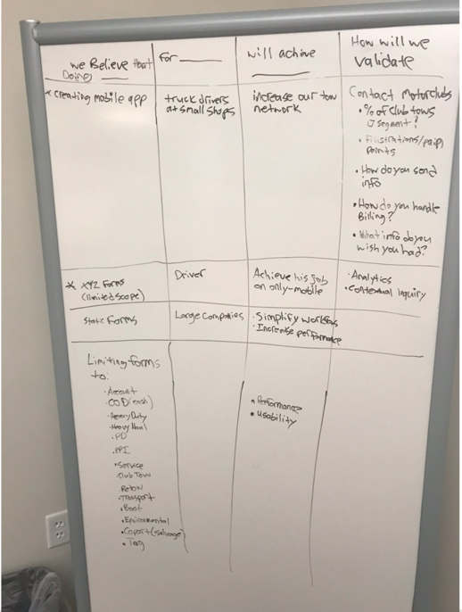
Hypothesis Statements
For these hypothesis statements, I used a template provided by Jeff Gothelf in his Lean UX workshop provided on safaribooksonline.com.
By outlining these statements, we were framing the requirements that would determine whether our not our designs were successful by the end of this design process.
User Research
Contextual Inquiry
Since this was a redesign of a current application, we wanted to observe how our users were currently using our platform in the field. We created a data log for our contextual inquiry for better discoverability and went in teams of at least 2 to gather data.
After conducting our contextual inquiry, we gained several crucial insights:
- Drivers don't need all of the form fields from the web platform. A driver's top priority is speed and efficiency, and scrolling through dozens of unneeded form fields decreased efficiency.
- Some information was specific to certain jobs and not applicable to others. For example, a towing operator that boots cars doesn't car as much about the make and model of a vehicle as towing operators doing roadside assistance.
- Most drivers are paid almost entirely on commissions, so an income-related screen would be extremely beneficial to some
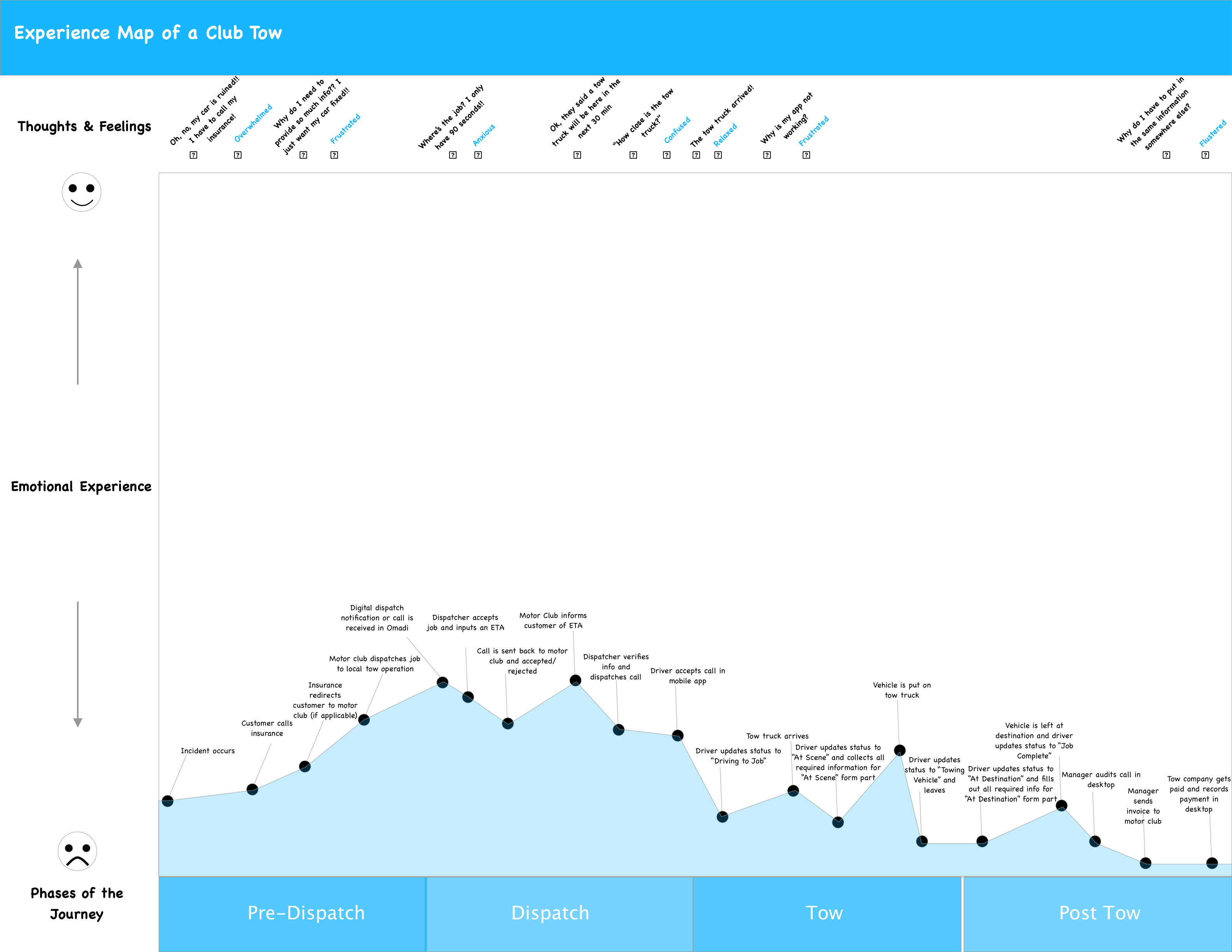
Journey Mapping
After being in the field, I created a journey map of theentire towing experience to better understand visualize the emotions and pain points of the tower and dispatcher, as well as to better understand all of the touchpoints of a tow job.
Looking at the tow experience overall, it was very frustrating, but as a design team we focused on improving the pains and frustrations of the tow drivers since the business requirement we were accomplishing was focused on our mobile app.
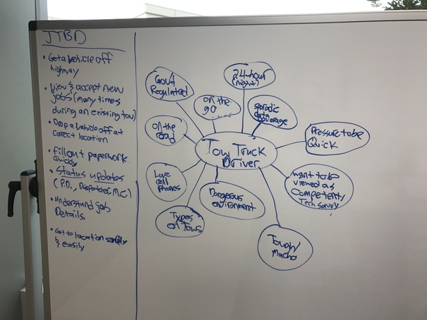
Jobs Theory
I decided to use the Jobs Theory methodology in during this process to make sure we were focusing on the user and not focusing on fitting a solution into a specific market. Using the research and journey map, I created a list of Jobs to Be Done (JTBD) the tow driver would be focusing on when trying to finish a tow.
During this exercise, I learned that time was of the essence for tow truck drivers. They got paid by the job, so they were looking for the quickest way to accept a job, get to the job's location, perform the job, and submit the necessary paperwork to finish it.
Our new mobile app needed to have features that reduced the amount of time to indicate where you are, that you've arrived, etc.
Personas
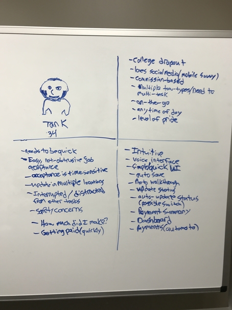
After analyzing the current Omadi user experience and mobile user's JBTD, I created a persona for our mobile app: Tank.
I was seeing that these tow drivers tended to not have 4 year degrees and were also thinking about safety: how to get to a tow safely, how to do a tow safely, and how to provide for their families. It was imperative to:
- Make the mobile app simple and intuitive
- Include time-saving features/functionalities
- Create a way for drivers to view where they are and where they're going
- Make jobs details easily viewable
Wireframing
Low Fidelity
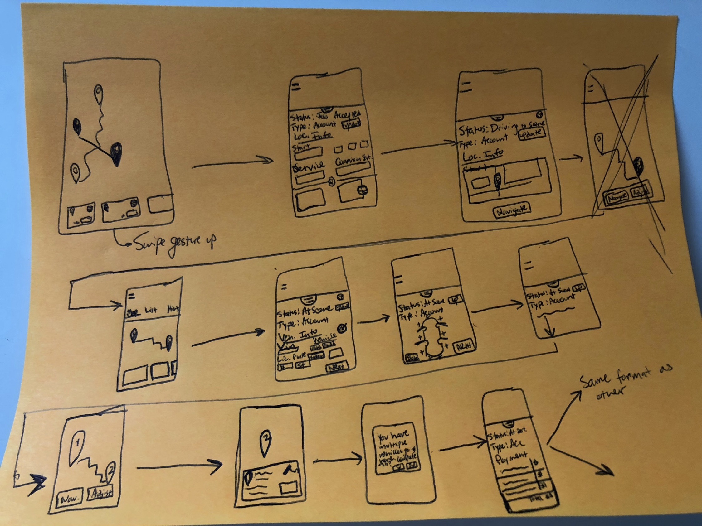
After gathering insights about usability and usage scenarios, we set about designing solutions. I was asked to create several low-fidelity workflows, focusing on workflow and layout rather than design and look.
Using our user research and business requirements, I sketched out a few mobile app ideas including:
- Some type of map overlay for drivers to understand their where they are
- Cards of jobs. My user research indicated this was an important JTBD and there needed to be a simple way of viewing what the make, model, etc. of the job was
- A quick and easy way to add photos. For liability reasons drivers need a way to add photos at a job, and I explored some of that

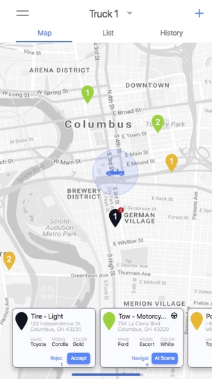
Medium Fidelity
We created our medium fidelity wireframes in Sketch. We decided to not do any usability testing before moving into this phase because of time constraints.
We did do some initial user feedback sessions on our medium fidelity prototypes. Using an app called Expo, received user feedback over the phone, which I was able to conduct with two drivers. Some of the insights we received were:
- Drivers were using "accept" as a way to acknowledge a job, not decide which jobs they'd perform.
- Our map view with cards wasn't effective because drivers were more concerned about their current/previous jobs than where they were.
- Drivers only cared about jobs that had been completed within a 24-48 time frame. If any information needed to be updated for a job, it'd fall within that time fram, not 1-2 weeks or indefinite.
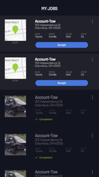
High Fidelity
Due to time constraints, we weren't able to create our high fidelity mockups in time to present to our advisory board, but these were the final designs we had created before I was laid off.
Based on our previous feedback, we did the following:
- Created a card view of jobs as the main screen since our feedback sessions with drivers indicated that was more important
- Used a color hierarchy to indicate active and completed jobs
- Only included jobs in the card view from the last 48 hours. Once a completed job was older than 48 hours it wouldn't show up anymore
One important thing is that a decision on the functionality of "accept" hadn't been made before I was no longer with the company, but I would have changed the text to "Acknowledge" or "Accept Job" depending on how we wanted the functionality to work.
Learning & Limitations
What I Learned
During this process, I learned the following:
- Collaboration is key when moving quickly. We were on a short time frame and needed to consistently meet with the other engineers to talk about what next steps were and to stay on track.
- User research was awesome. I loved going out into the field to do contextual inquiry and understanding the use cases behind how these tow drivers were using our product.
- Jobs Theory was a great working model to operate in for redesigning here. Focusing on our hypotheses and how to move forward helped us focus on what we needed to accomplish to meet our goals.
Next Steps
Unfortunately, I was laid off due to workforce reductions. If I were to continue designing this mobile app, I would've done the following:
- Build a working prototype from the high fidelity wireframes created
- Determine a participant profile and recruit Omadi mobile users to participate in a usability study
- Create a research plan and script
- Conduct mobile usability sessions with specific tasks related to our original design goals
- Synthesize results, and most likely retest
- Continue to iterate until an MVP is decided on and move to production
Projects
Privato FitnessDiscovery research, visual design, design systems, user flows, user stories, data synthesis, how might we questions, usability testing
Omadi Torch-Problem Sync & performance issues, painful usability, high task completion time -Solution Only sync information drivers need, all towing types in one list, geo-tagging, consistent workflow for all jobs, interactive photos & damage reporting, mobile payments, eliminate time consuming inventory. -Role My role was as Jr. UX designer on the project. As Jr. UX designer, I owned the workflow of conducting field research with current users of the Omadi mobile platform, as well as assisted with the redesign process (visual design, user journeys, user flows, etc).
Ballot BuddyProject type
TinyTales Design SprintSpringboard
Metaverse UX ResearchProject type
Ticket Admin ResearchProject type
© Copyright 2018 - All rights reserved